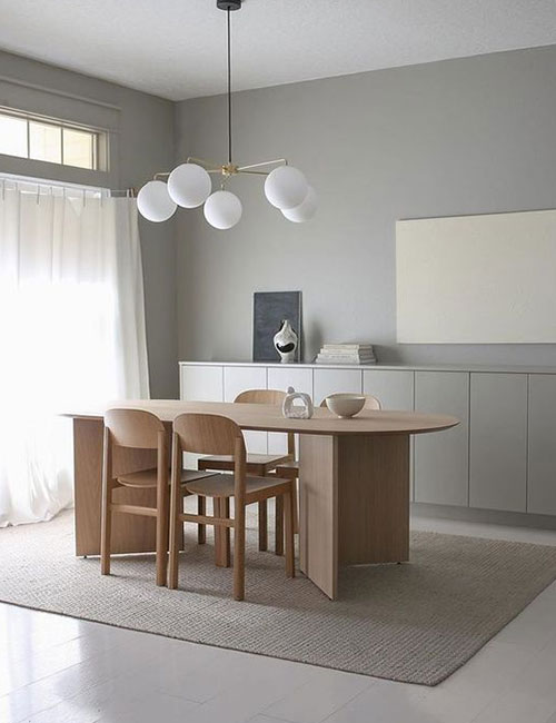
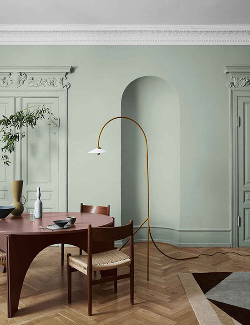
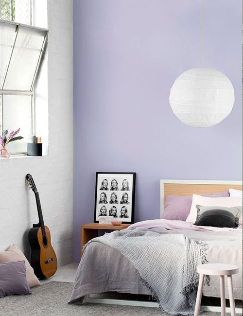
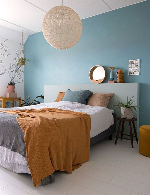
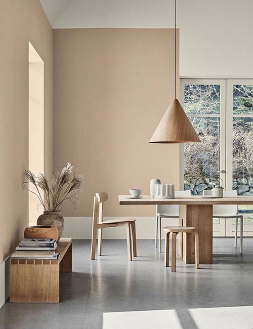
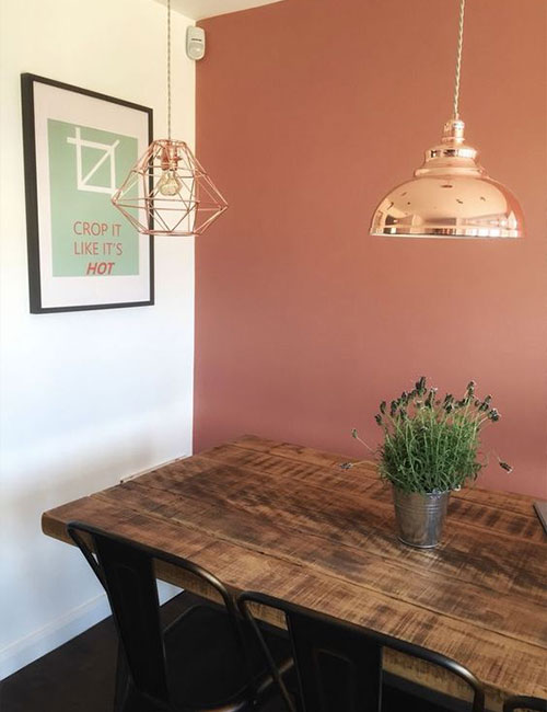
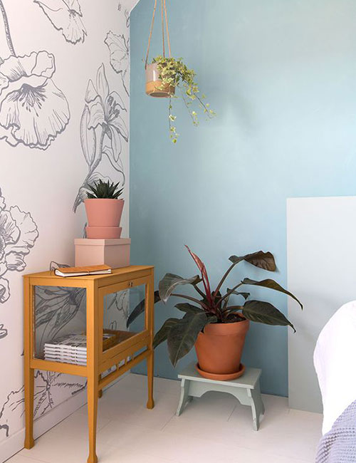
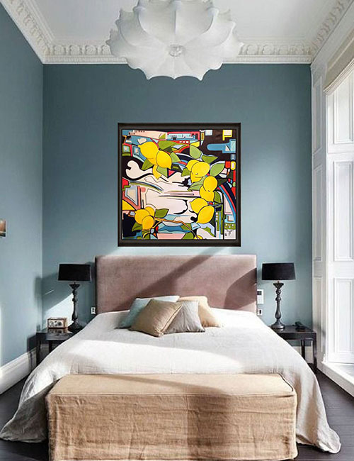
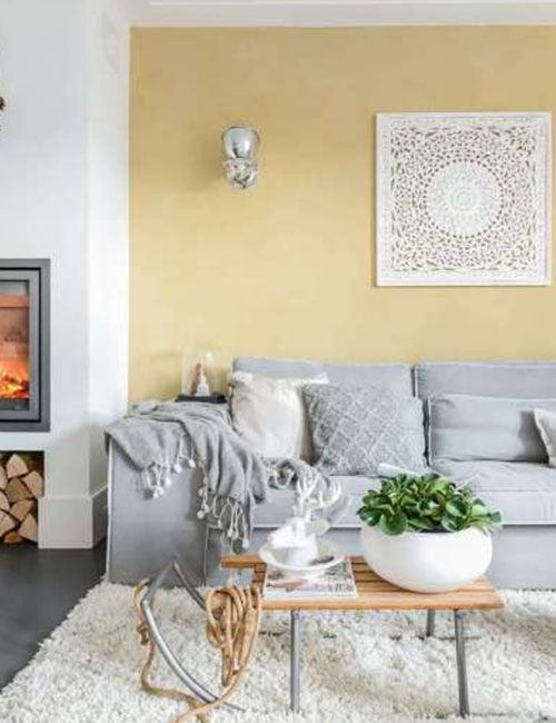
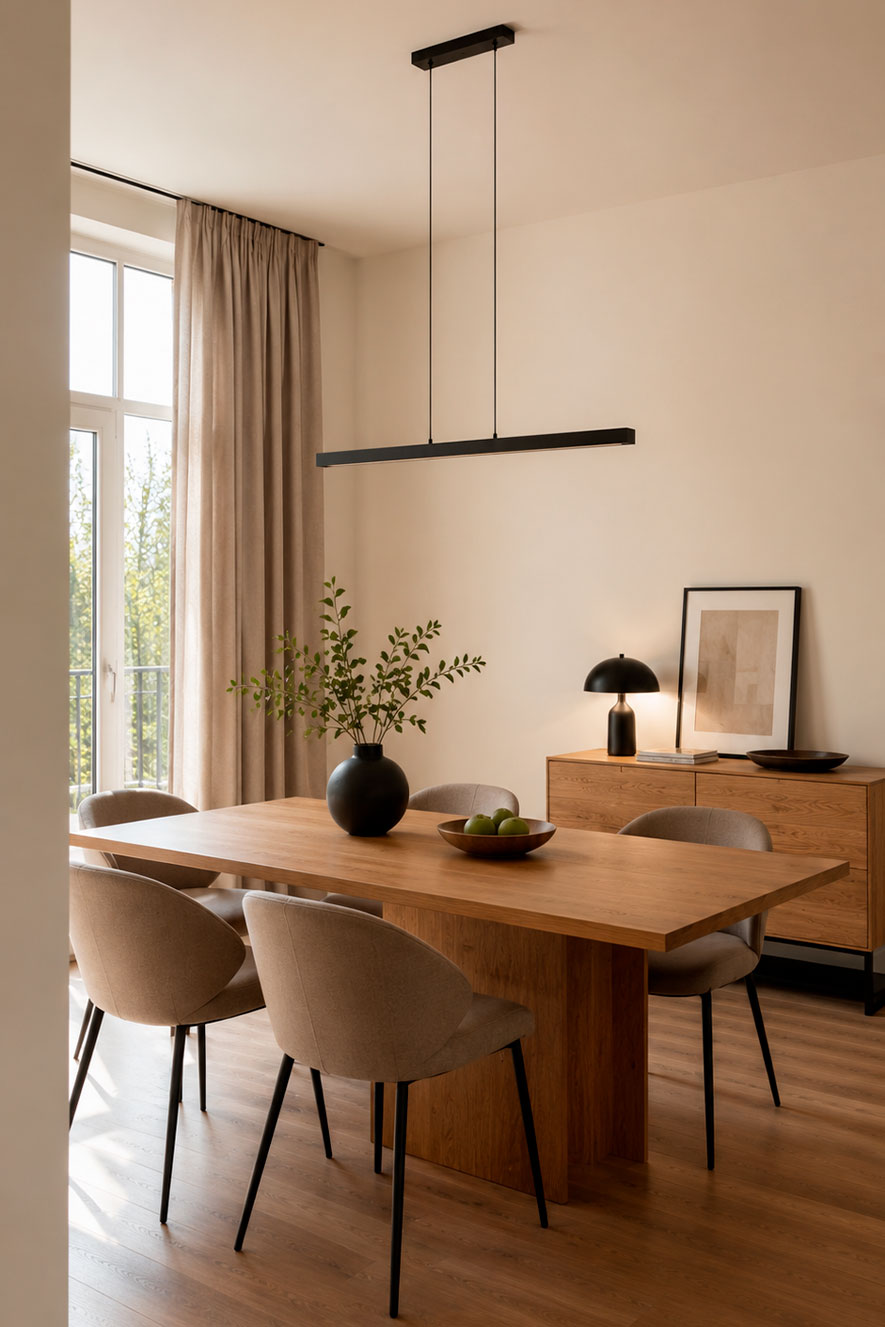
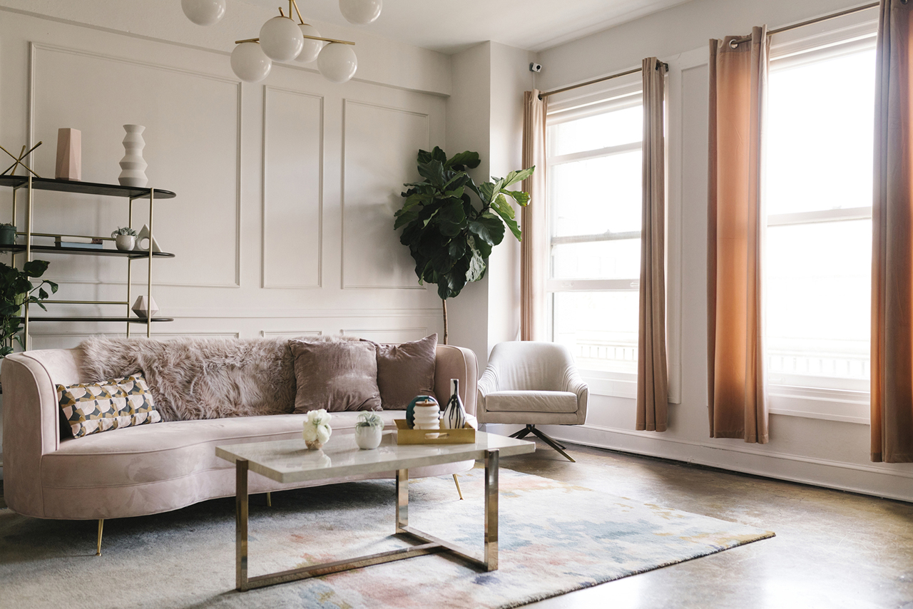
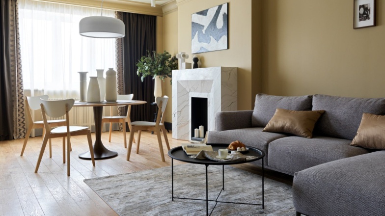
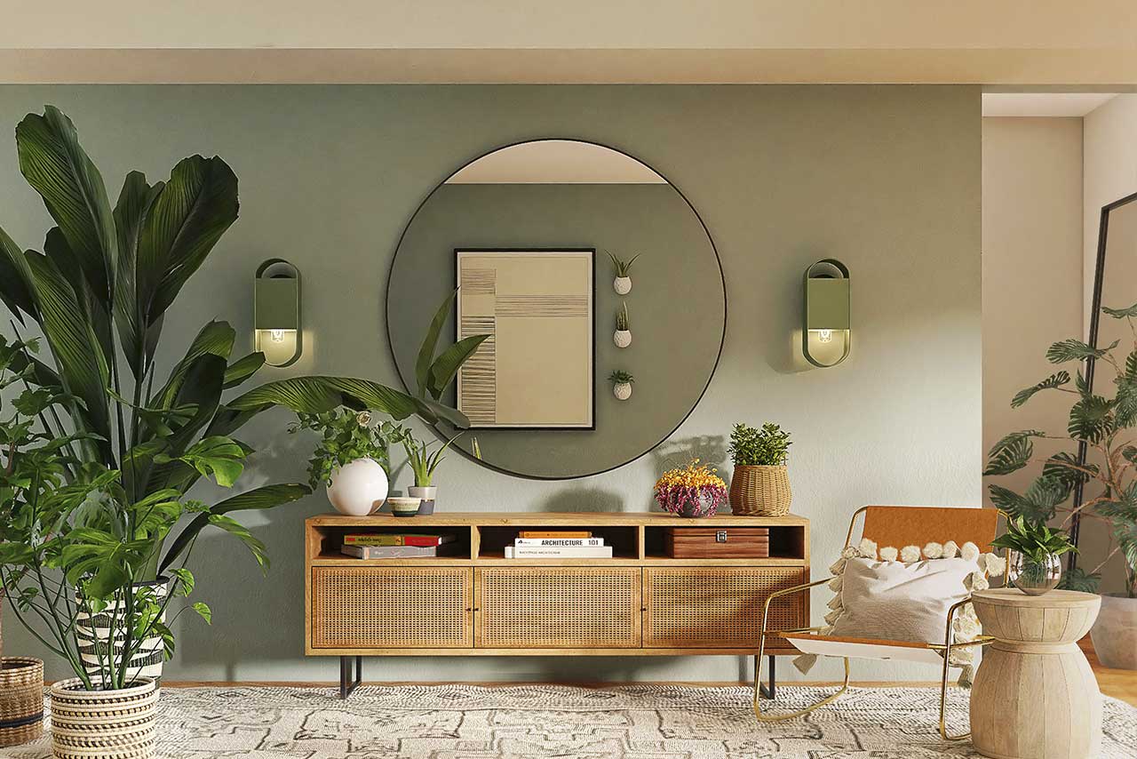
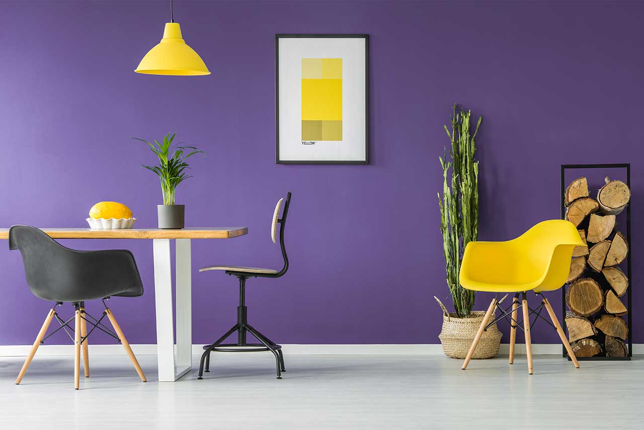
Light grey shades are prized for their versatility and ability to blend harmoniously with virtually any colour scheme. They create a sense of cleanliness, order and modernity, without overwhelming the interior. Thanks to its neutrality, this colour looks equally good both as a stand-alone choice and as a backdrop for striking furniture, textiles and decor
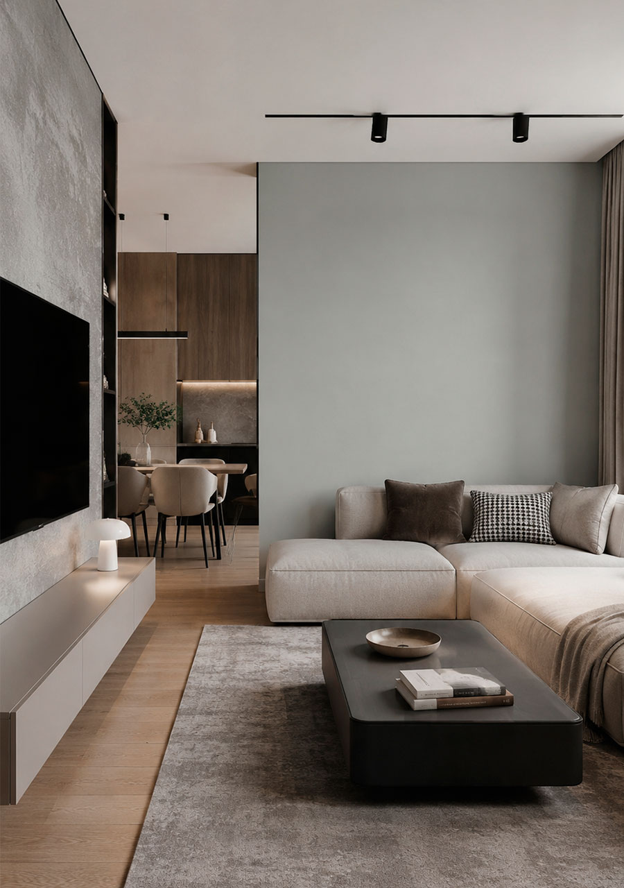
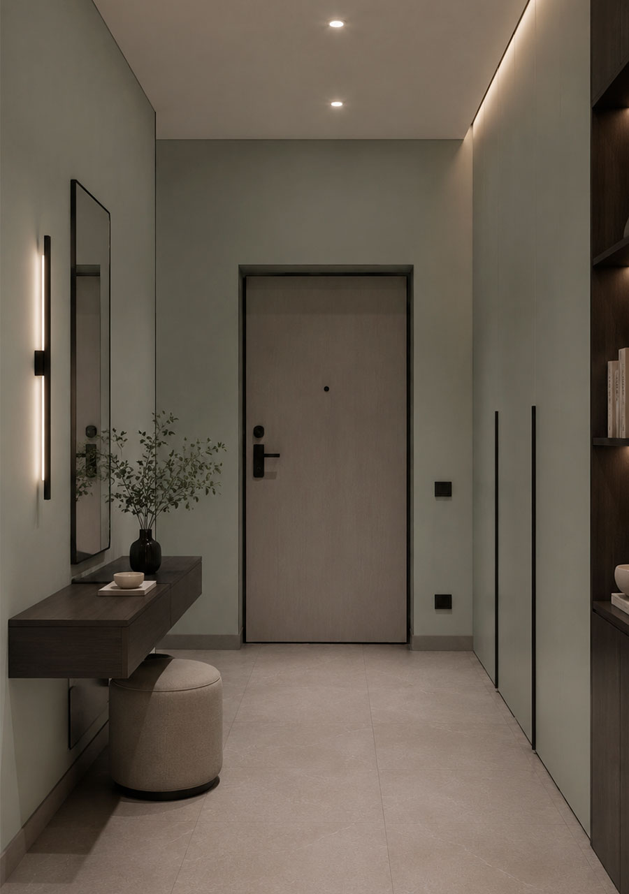
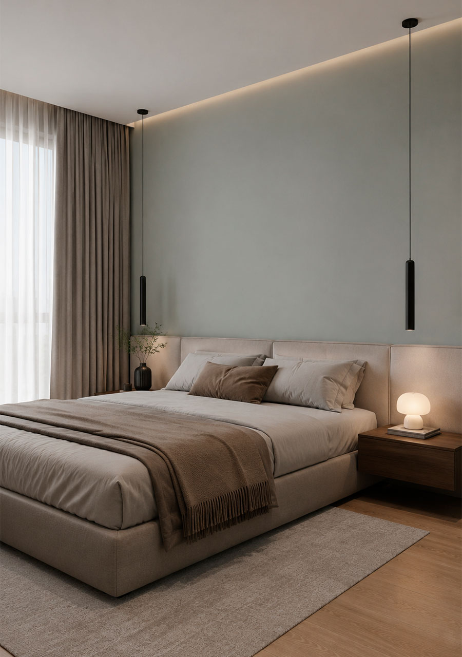
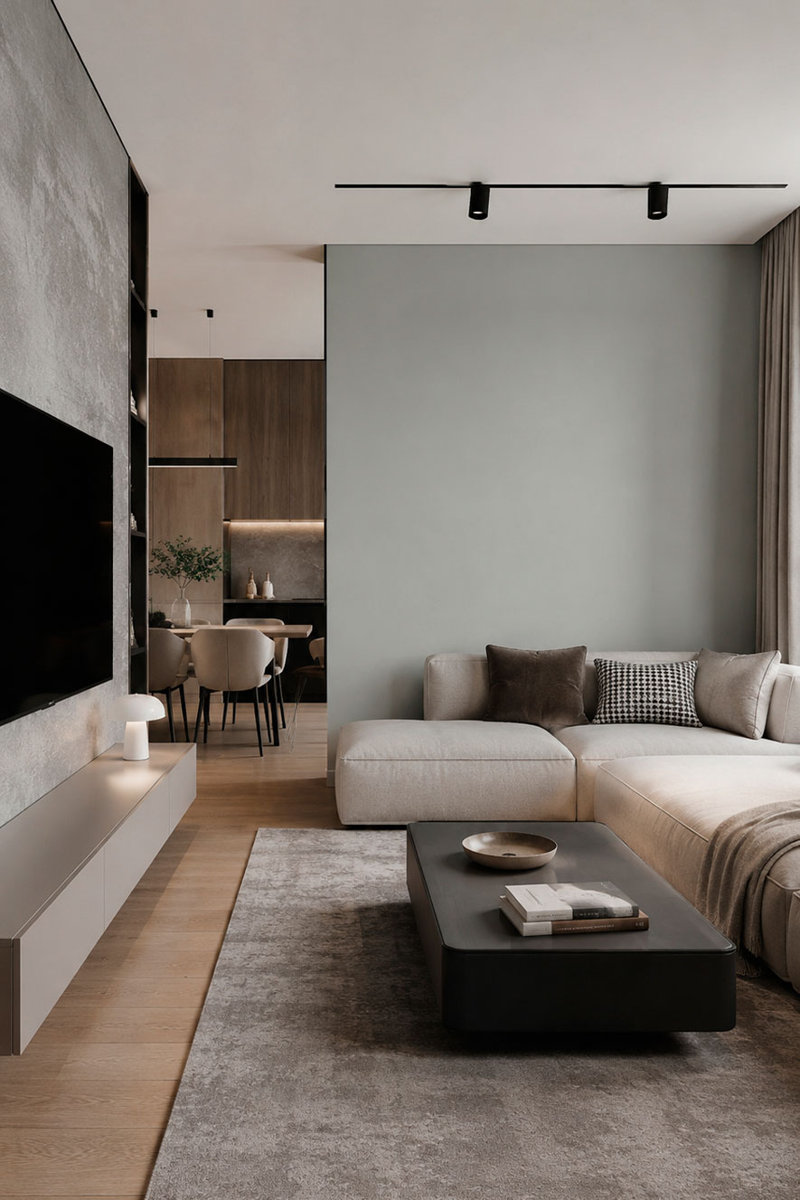
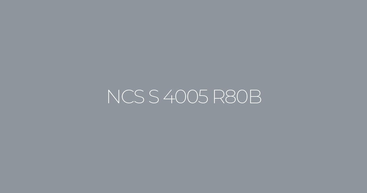
Colour NCS S 4005–R80B
A medium-dark grey with a barely perceptible cool bluish undertone. In a space, it comes across as a refined, understated grey that doesn’t ‘shout’, yet adds character and a contemporary feel to the interior. In design, this shade serves as a versatile base: it calms visual clutter, highlights textures (concrete, metal, wood, fabrics) and looks equally good on large surfaces and in details.
Two similar shades:
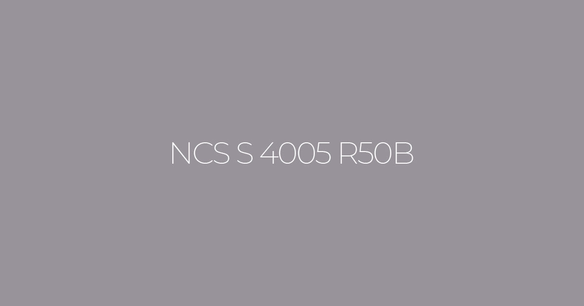
NCS S 4005 R50B
It has the same saturation but with less of a blue undertone. It is a more neutral, ‘purer’ grey, which is easier to combine with warm wood tones, beige and pink accents in both classic and contemporary interiors.
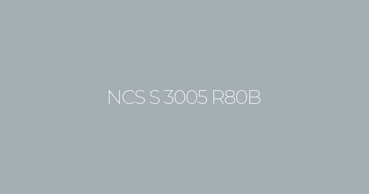
NCS S 3005 R80B
Slightly lighter, with a similar cool undertone. It gives the impression of a lighter, ‘airy’ grey and works best in small rooms where it’s important to maintain a sense of space: the living room, hallway and children’s room.
How does the colour appear under warm and cool lighting?
- Warm light (2700–3000 K): softens the coolness of grey, making it slightly warmer, closer to a soft grey with a slight beige tint. Ideal for evening settings in the living room or bedroom, where you want a cosy atmosphere.
- Cool light (4000 K and above): emphasises the bluish, cool undertone; the colour appears sharper, more austere, closer to ‘office’ grey. Well-suited to workspaces, studies, kitchens and bathrooms, where a sense of order and freshness is important.
Which colours go well with it (accent walls and furniture)
- Warm white / light beige (NCS S 0502‑Y, S 1005‑Y40R) — a classic combination: a subtle grey paired with a light base. Suitable for the living room, bedroom, hallway and kitchen.
- Natural light wood (oak, ash, birch) — softens the coolness of grey, adding a natural feel and cosiness, particularly in Scandinavian and contemporary styles.
- Pastel accents (soft blue, pale green, powder pink) — create a light, contemporary palette for bedrooms, children’s rooms and small living rooms.
- Deep blue / dark grey (S 5040‑R80B, S 4500‑N) — adds contrast and depth to furniture, frames and textiles in contemporary, masculine interiors, studies and home cinemas.