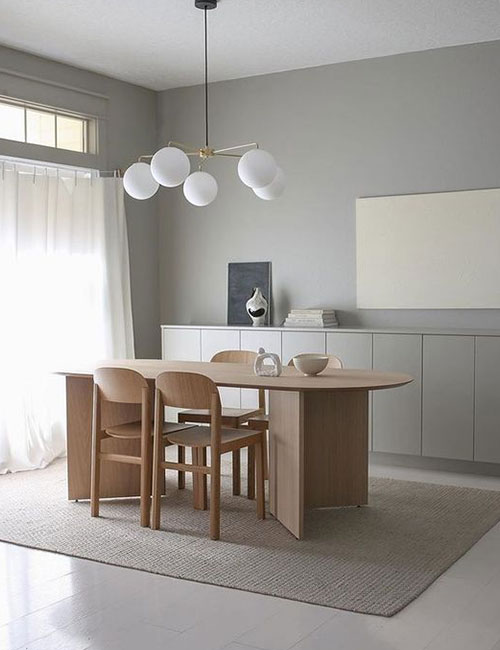
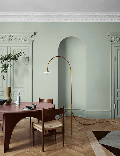
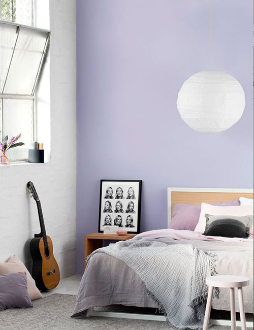
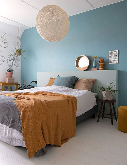
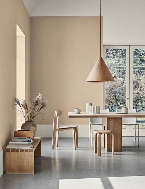
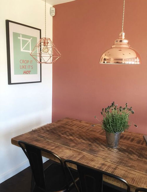
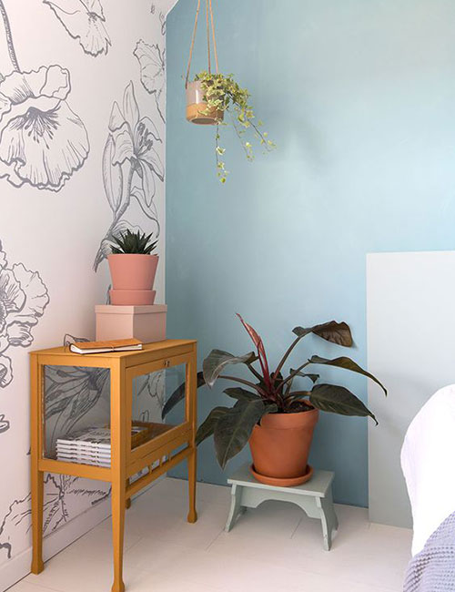
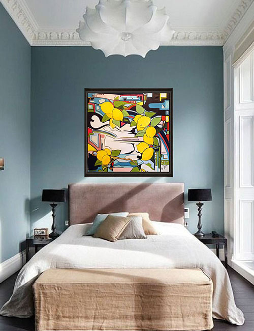
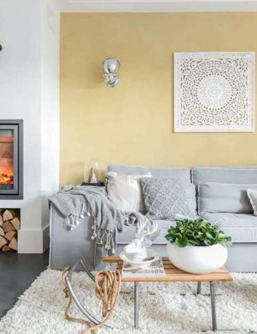
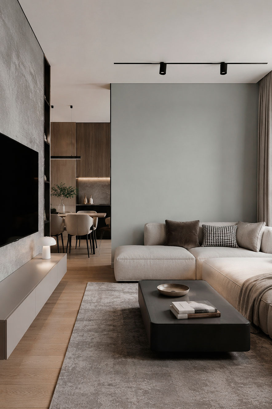
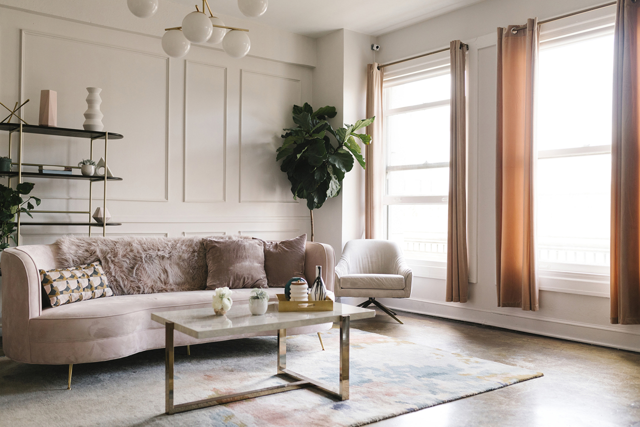
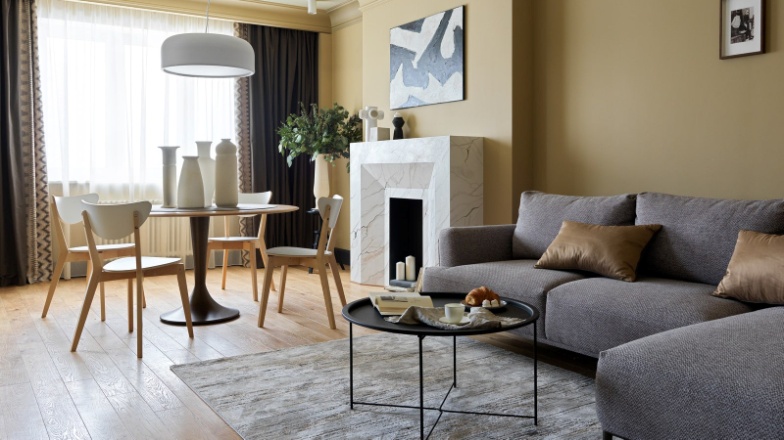
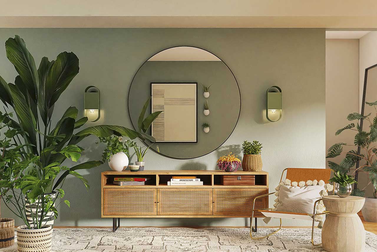
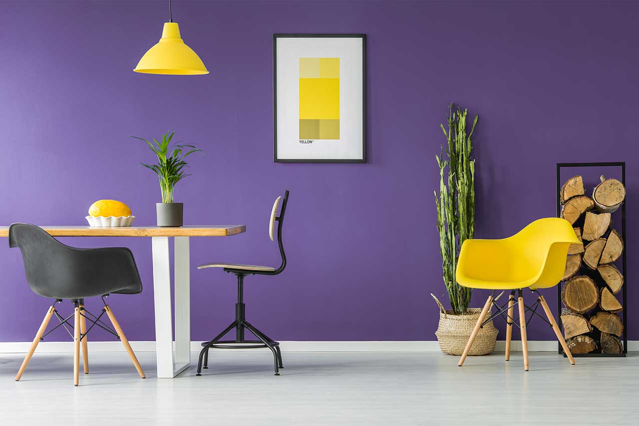
A creamy white is a versatile base colour for interior design. It creates a bright, airy space, fills the room with natural light and allows other colours to come into their own in the most harmonious way. This shade remains a timeless choice regardless of style – from minimalism and Scandinavian design to classic and contemporary elegance.

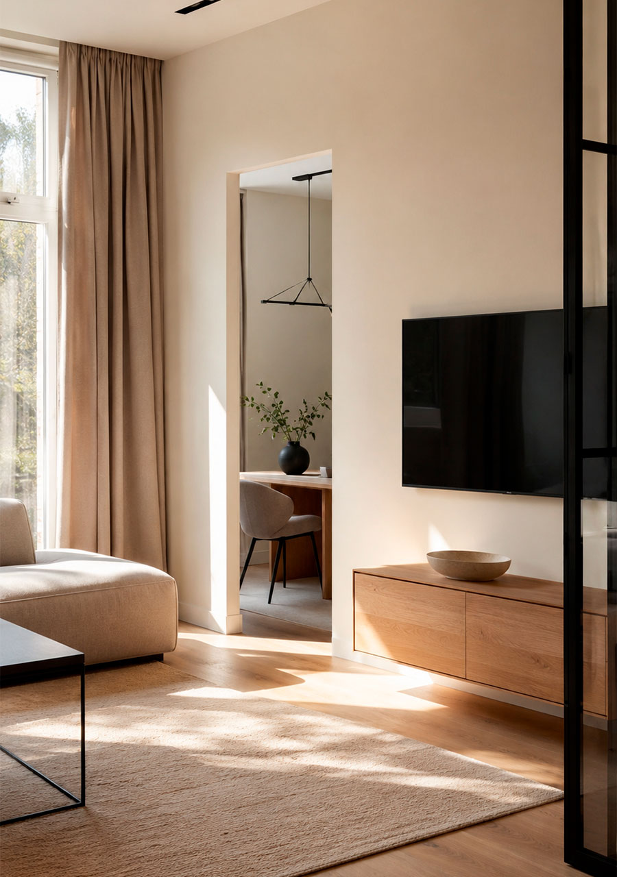
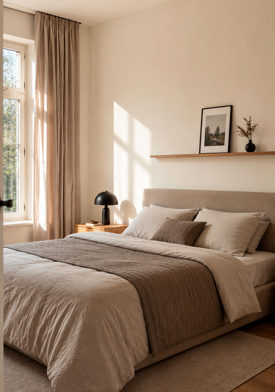
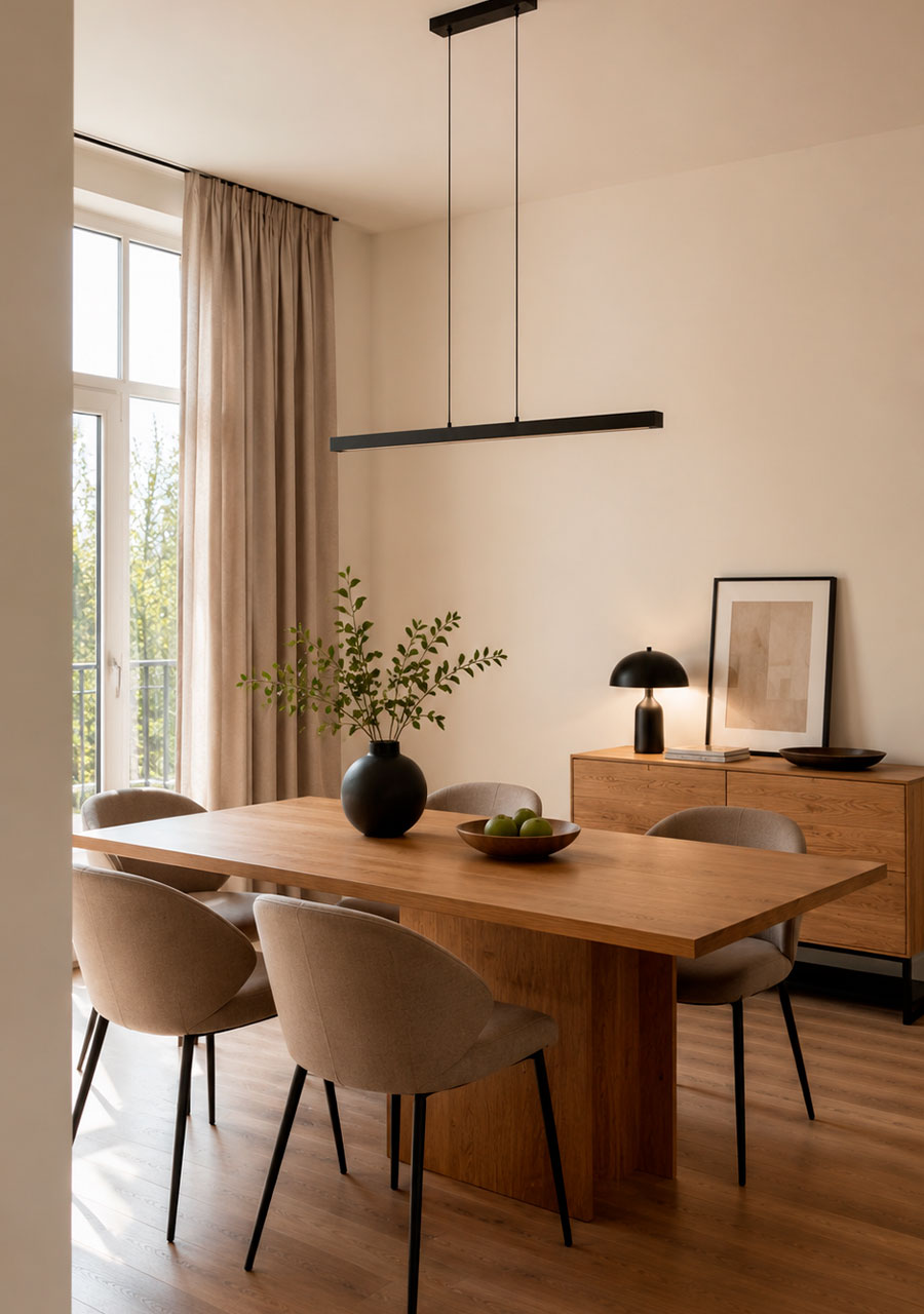
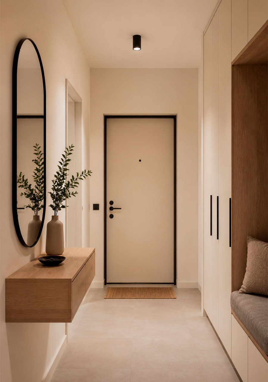
Colour NCS S 0502 Y
An exceptionally light, delicate shade with a subtle warm yellow undertone. In a room, it almost comes across as a ‘soft white’, but unlike cool whites, it adds a touch of warmth and cosiness to the interior. In design, it serves as the perfect backdrop: it doesn’t draw attention to itself, enhances natural light, and makes the room appear larger and brighter.
Two similar shades:
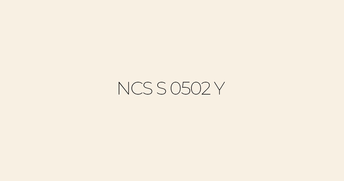
Colour NCS S 0502-Y50R
It is just as light, but neutral, with no yellow undertones. It is a ‘pure’, almost white shade that is better suited to contemporary, minimalist interiors in cool or neutral tones.
Colour NCS S 1002 Y
A little more colour and depth, a warm, light beige shade. It evokes the feel of ‘coffee with milk’ and works even better in places where you want more warmth: in bedrooms, children’s rooms and north-facing rooms.

How does the colour appear under warm and cool lighting?
- Warm light (2700–3000 K): enhances a subtle yellow undertone, making the colour even warmer, reminiscent of a delicate cream or warm milk. Ideal for creating an evening atmosphere in the living room and bedroom, where softness and cosiness are desired.
- Cool light (4000 K and above): ‘neutralises’ the yellowish tint; the colour appears closer to a pure light grey or cool white. Well-suited to workspaces, the kitchen and the bathroom, where clarity and freshness are important.
Which colours go well with it (accent walls and furniture)
- Natural wood (light oak, ash, birch) — a classic combination: a light base + warm wooden textures. Suitable for the living room, bedroom, hallway and children’s room.
- Pastel accents (soft blue, pale green, powder pink) — create a light, ‘airy’ colour scheme. A lovely option for children’s rooms, bedrooms and small living rooms.
- Dark accents (graphite, deep green, matt black) — add contrast and a ‘luxurious’ look. They work wonderfully on furniture, picture frames and light fittings in contemporary interiors.