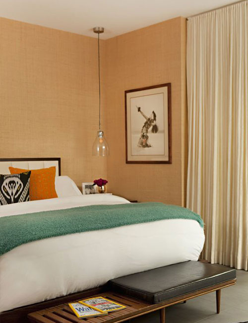
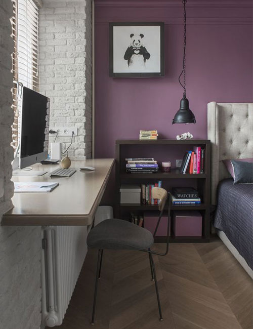
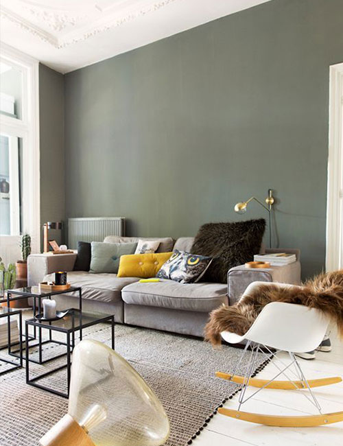
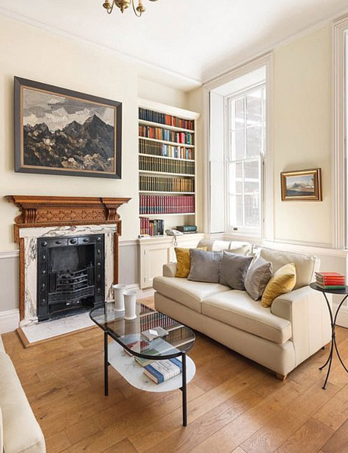
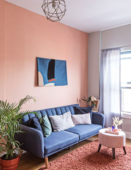
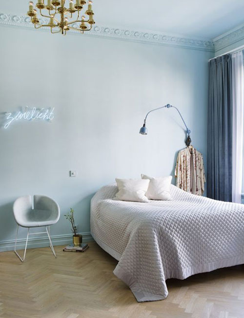
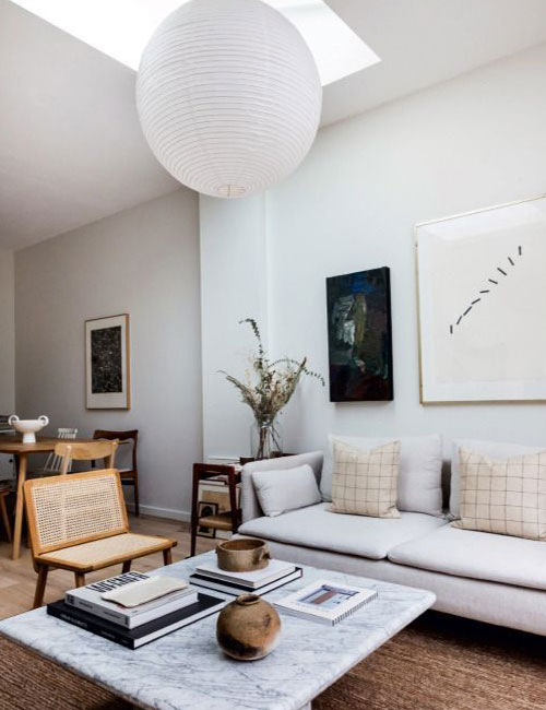
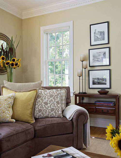
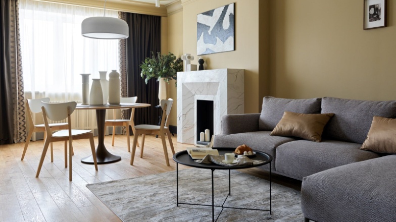
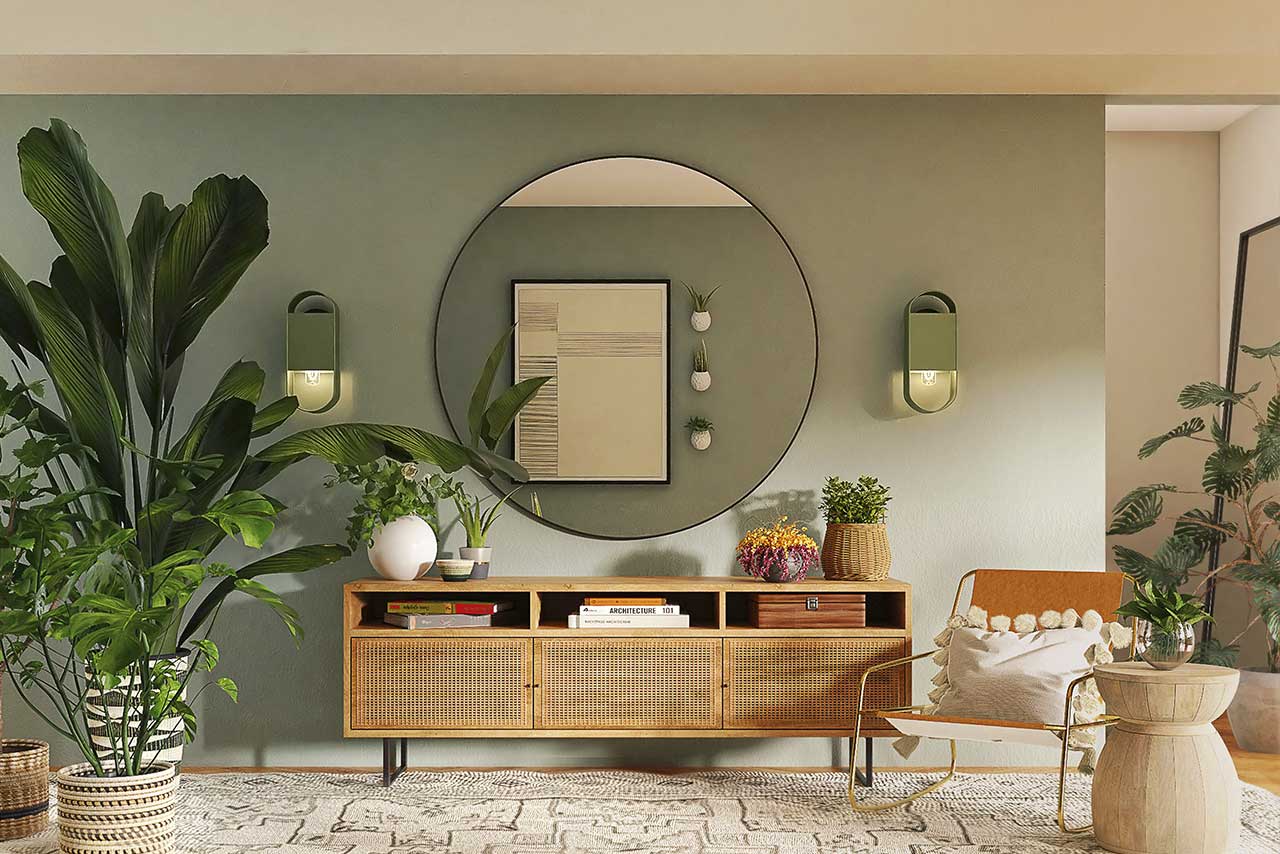
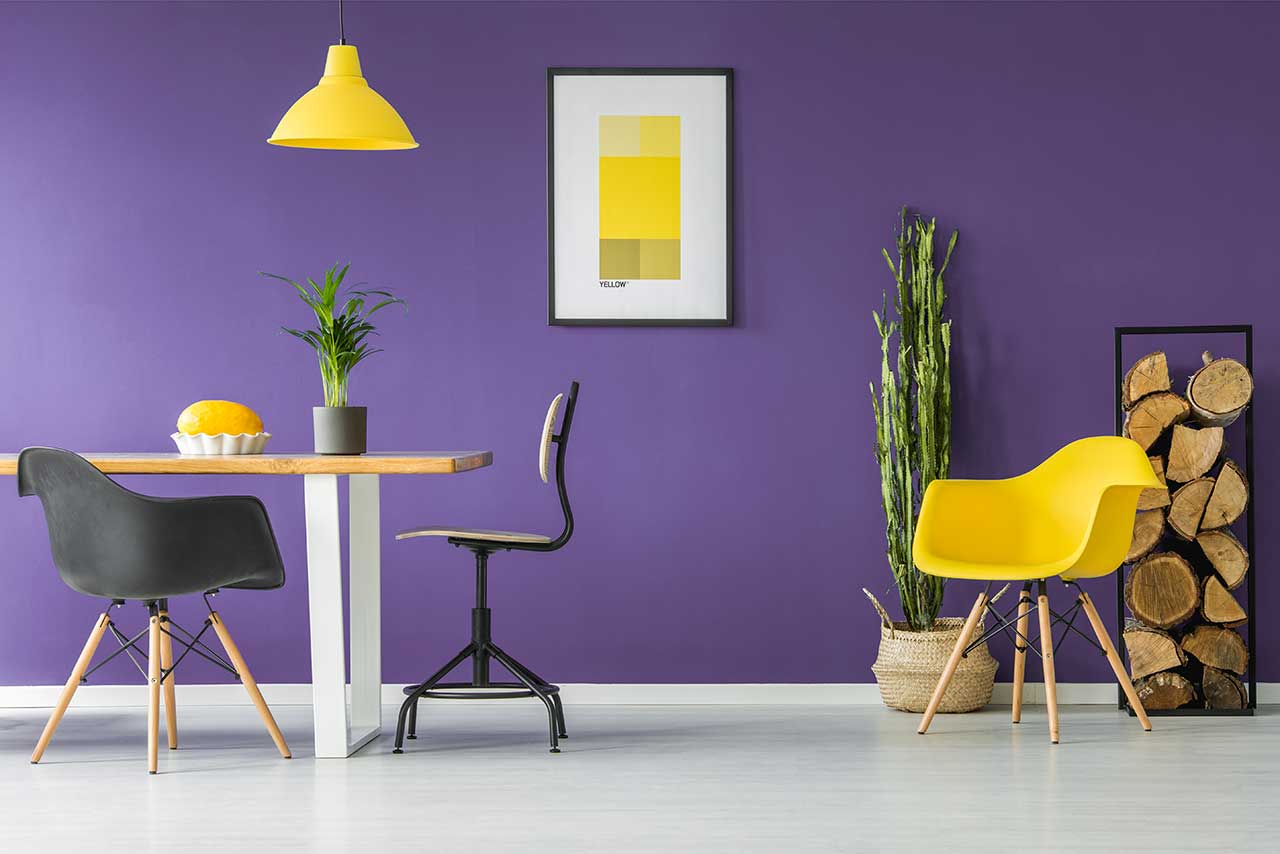
Emerald is one of the most striking natural shades, adding depth, elegance and a sense of harmony to an interior. It pairs beautifully with natural wood, stone and metal, helping to create a stylish space with character. This colour is ideal for use on feature walls as well as for defining individual areas.

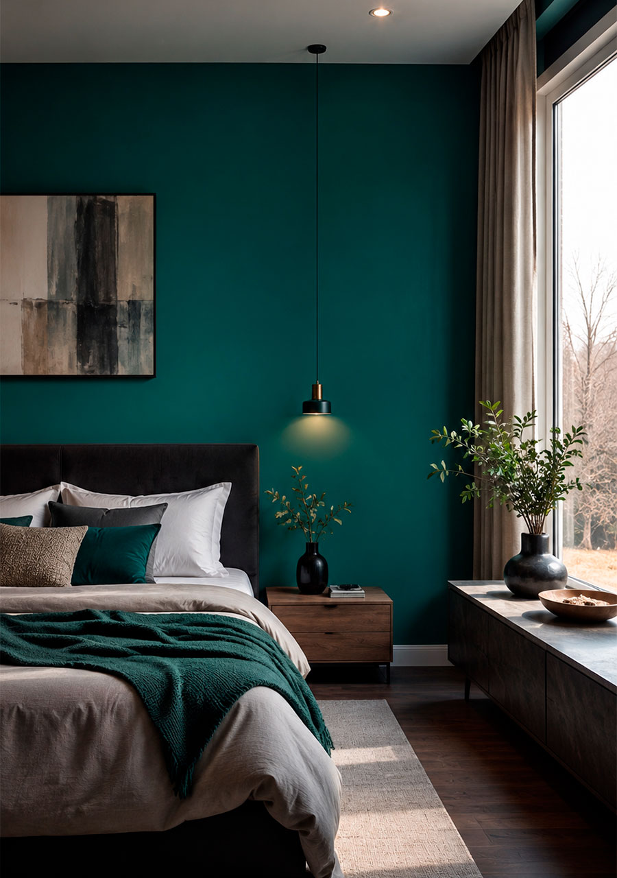
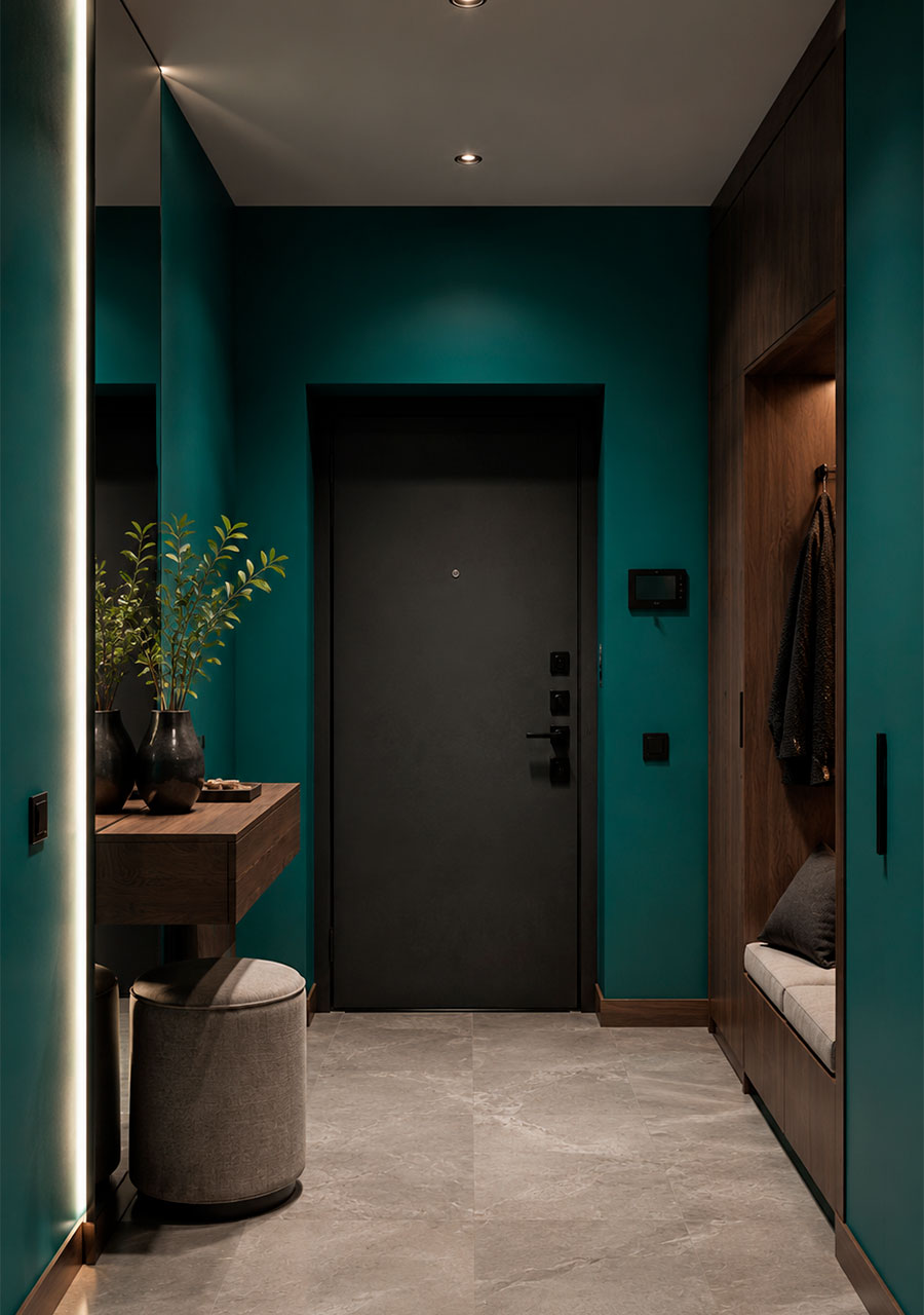
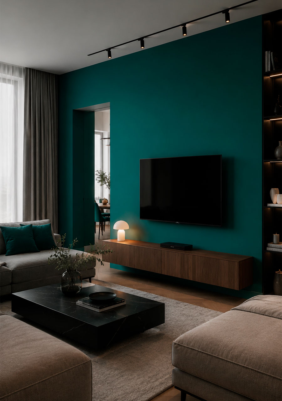
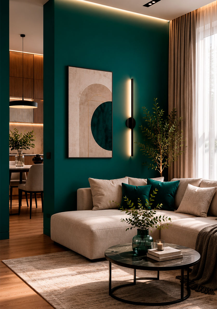
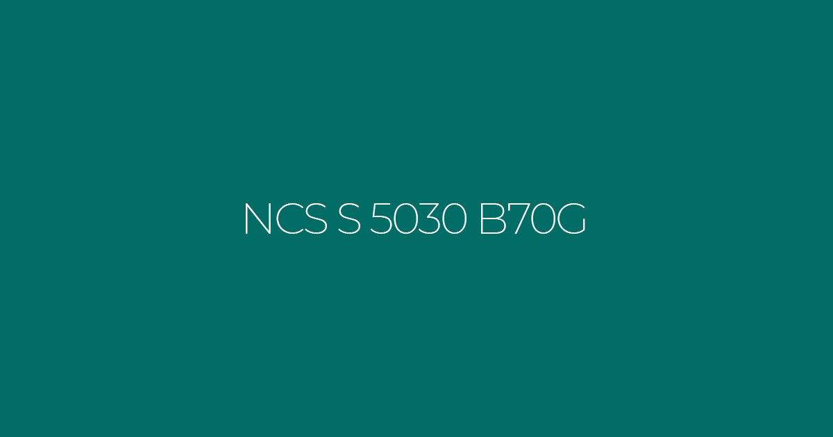
Colour NCS S 5030 B70G
A dark, muted green with a distinct cool bluish-green undertone. In a space, it is perceived as ‘nature’s deep whisper’: understated, dark and unmistakably elegant. In design, this shade acts as a strong accent: it has a calming effect, sets the mood for relaxation or concentration, highlights textures (wood, velvet, metal, stone) and looks particularly striking on large surfaces and when used to zone a space.
Two similar shades:
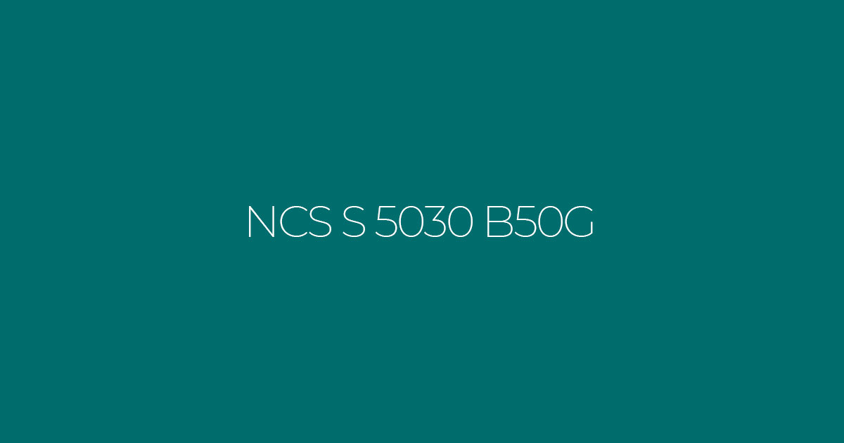
Colour NCS S 5030–B50G
A dark, muted green with a cool green-blue undertone. It looks more natural and neutral, reminiscent of the deep shade of pine needles or dense foliage. It pairs well with warm wood, beige, sandy, cream and brass accents, making it ideal for contemporary, classic, Scandinavian and eco-friendly interiors.
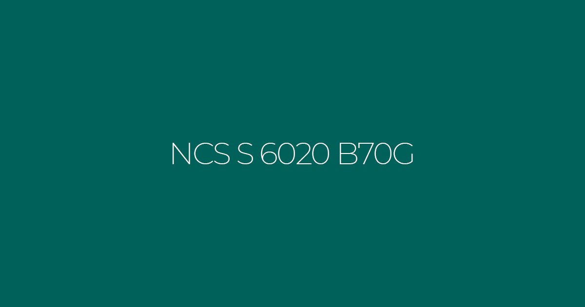
Colour NCS S 6020–B70G
Even darker and richer, with the same cool undertone. It evokes a ‘coniferous’, almost forest-like green and works best where maximum depth is desired: an accent wall in the living room, study, library or home cinema
How does the colour appear under warm and cool lighting?
- Warm light (2700–3000 K): softens the coolness of green, making it slightly warmer, closer to a deep ‘forest’ shade with a slight golden sheen. Ideal for evening settings in the living room, bedroom or dining room, where you want a cosy atmosphere.
- Cool light (4000 K and above): enhances the bluish-green, cool undertone; the colour appears sharper, more austere, closer to an ‘office-style’ dark green. Well-suited to workspaces, studies and bathrooms, where concentration and a sense of freshness are important.
Which colours go well with it (accent walls and furniture)
- Warm white / light beige (NCS S 0502‑Y, S 1005‑Y40R) — a classic combination: deep green + a light base. Suitable for the living room, bedroom, hallway and dining room.
- Natural light and medium-toned wood (oak, walnut, ash) — softens the coolness of green, adding a natural feel and cosiness, particularly in eco and Scandinavian styles.
- Golden and brass accents — emphasise the premium quality of dark green, particularly on furniture, fittings and lighting.
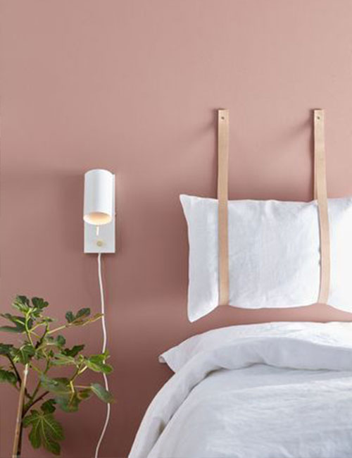
- Muted pink / powder (S 2020‑R, S 3020‑R) — creates a fashionable, contemporary ‘green + powder’ palette, a great option for bedrooms and living rooms in a contemporary style.
- Dark grey / graphite (S 4500‑N, S 5500‑N) — a stark, masculine combination for a study, a contemporary-style living room or a home cinema.