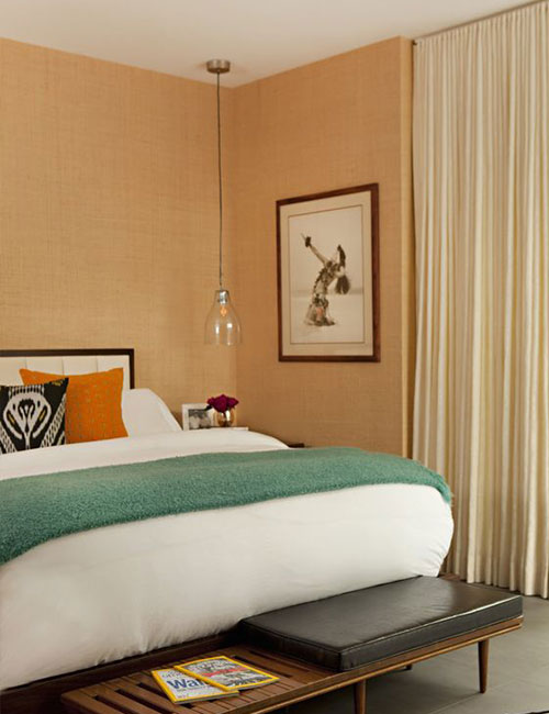
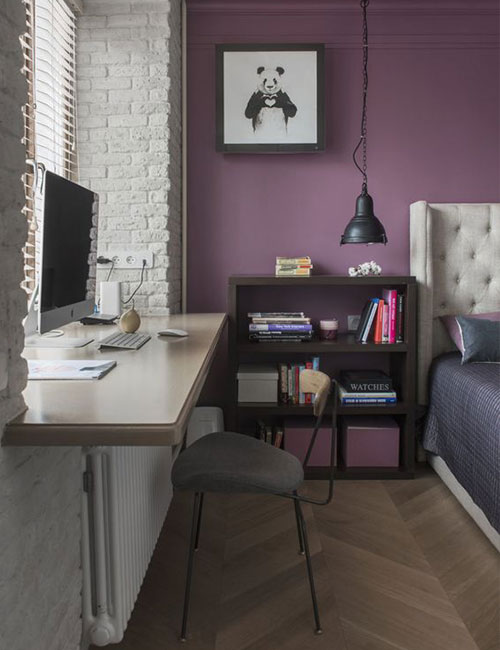
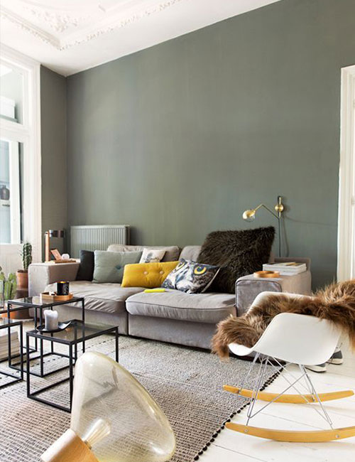
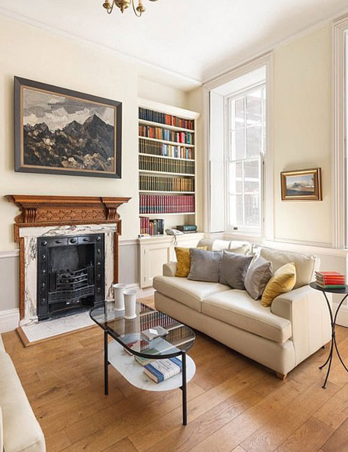
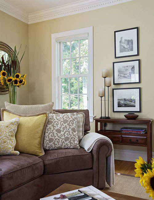
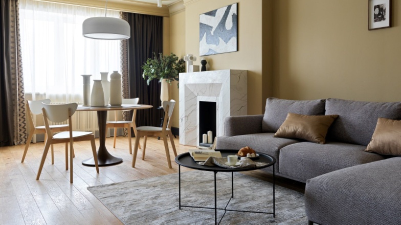
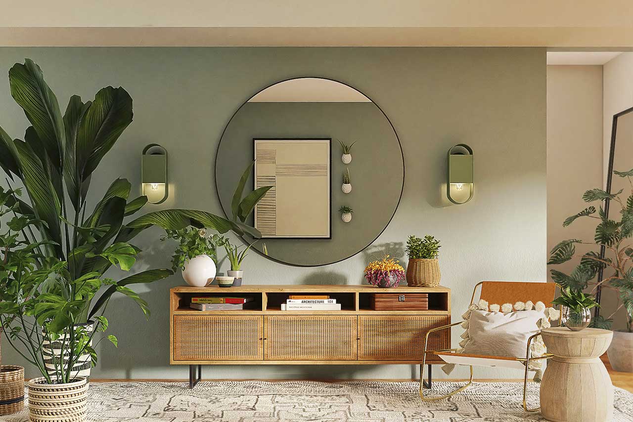
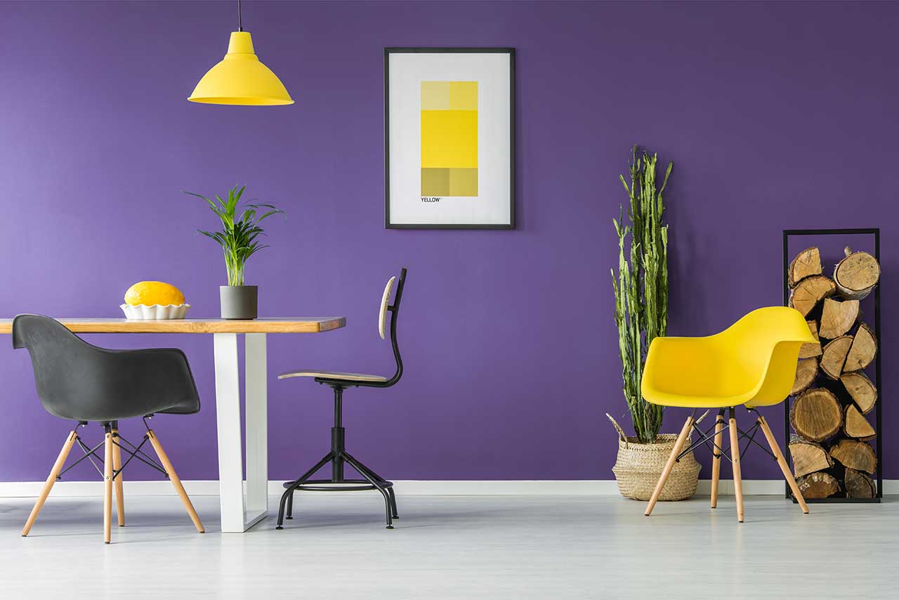
Chocolate shades have long been a symbol of elegance and cosy comfort. They create a sense of depth in a space, lend an air of sophistication to an interior and blend beautifully with both natural materials and contemporary decorative finishes. This colour works equally well in classic, contemporary, minimalist and eco-friendly styles.

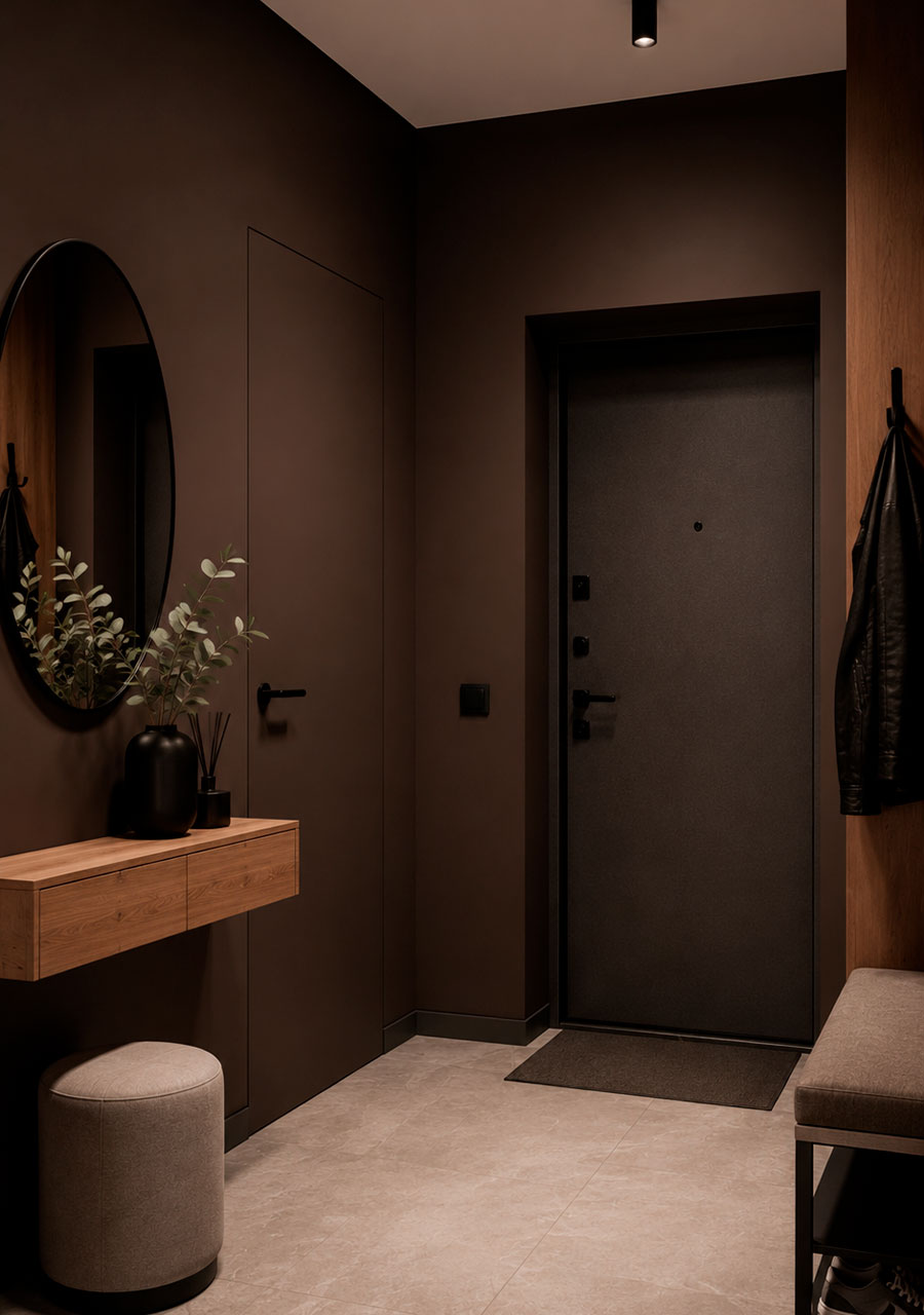
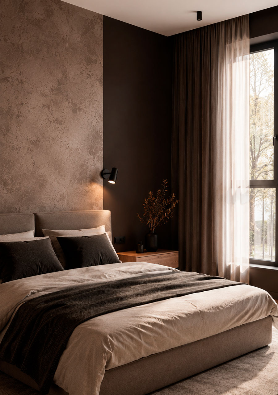
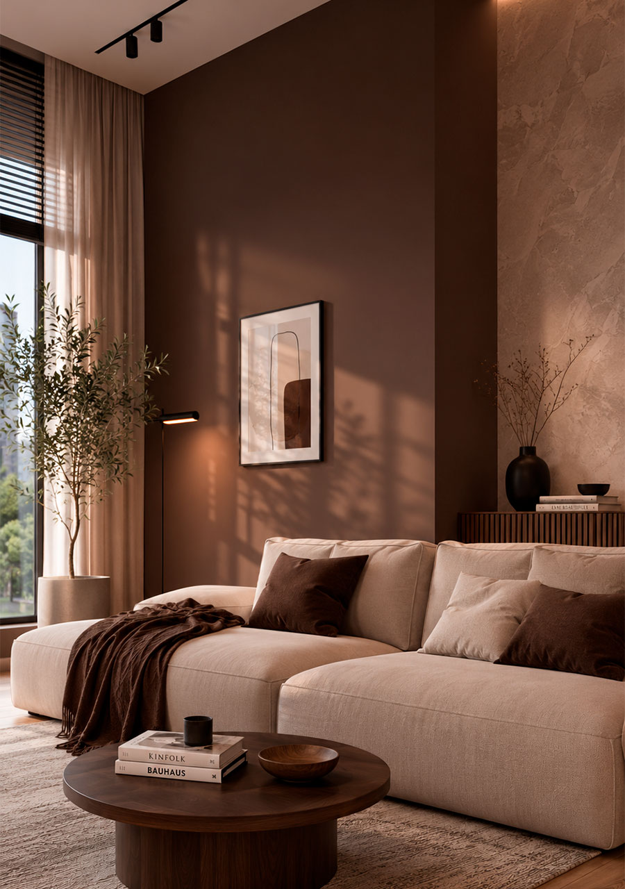
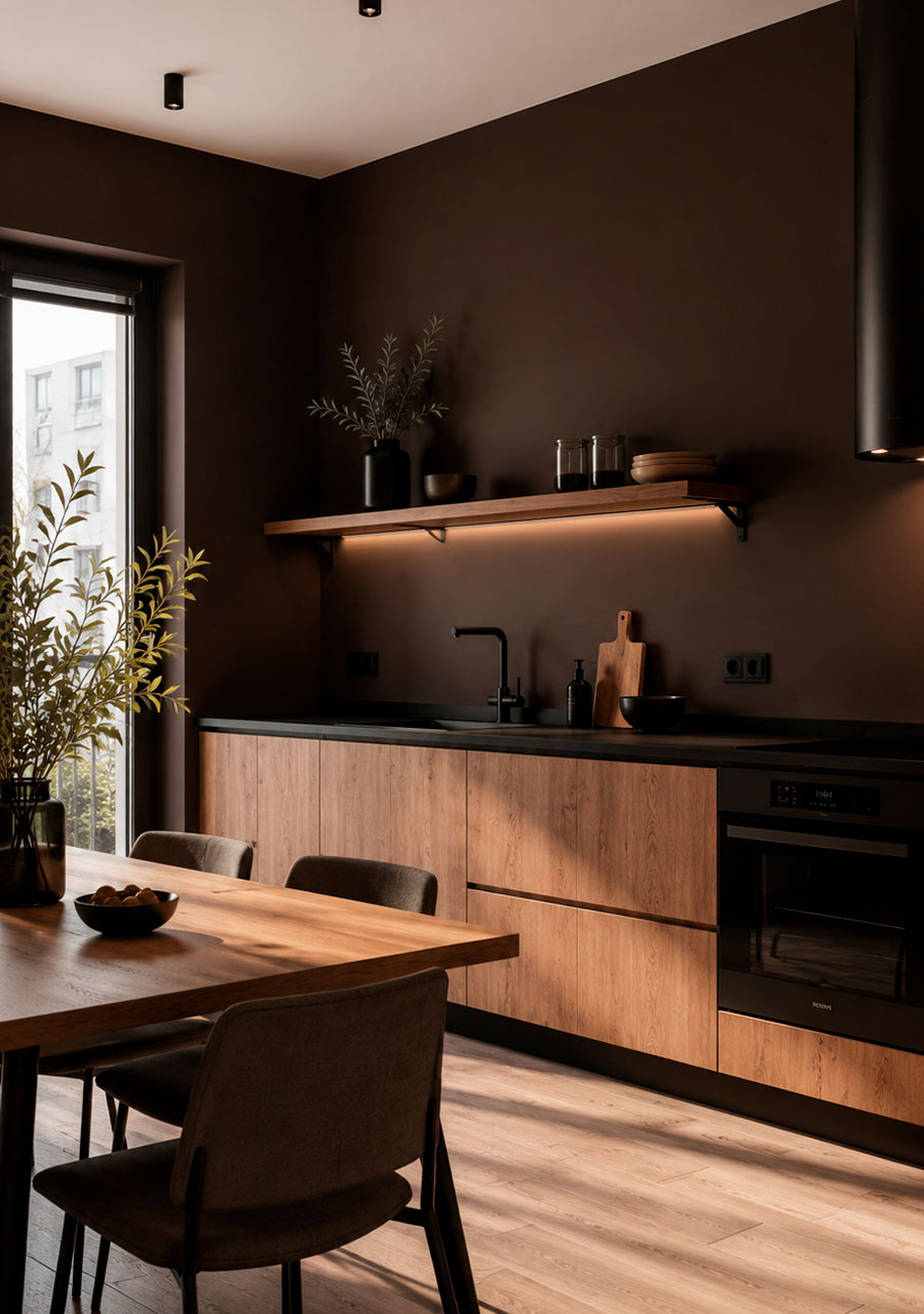
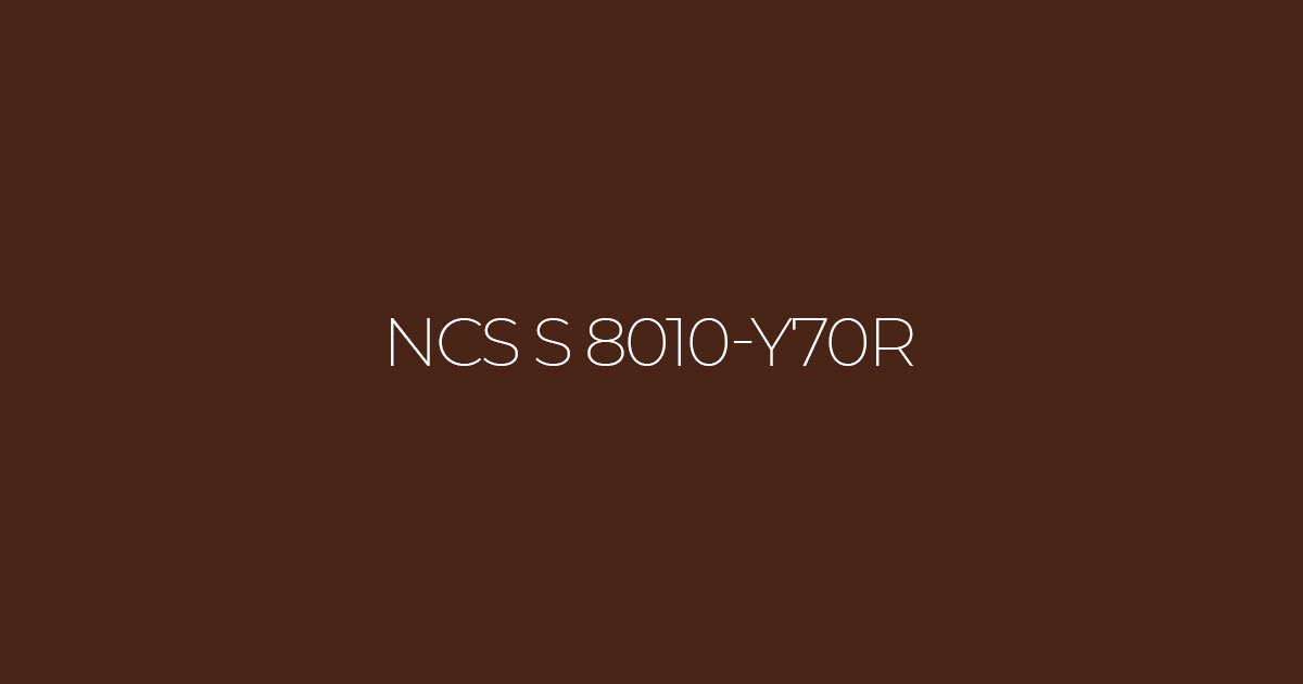
Colour NCS S 8010 Y70R
A deep, warm chocolate shade with a subtle reddish undertone, which creates a sense of cosiness, stability and elegant restraint within a space. In interior design, it acts as an ‘anchor’: it calms visual clutter, highlights textures (wood, leather, metal) and looks good both on large surfaces and as accent colours.
Two similar shades:
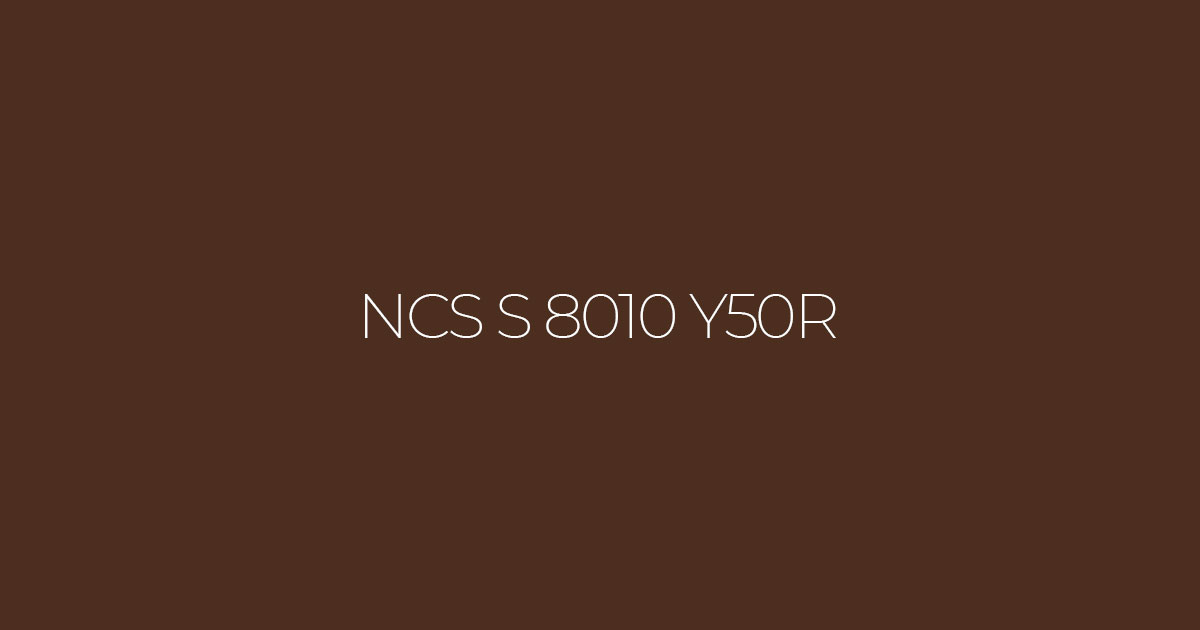
NCS S 8010 Y50R
A more neutral chocolate shade with a less pronounced red undertone. It works well in light, contemporary interiors and pairs easily with beige, cream and wood tones
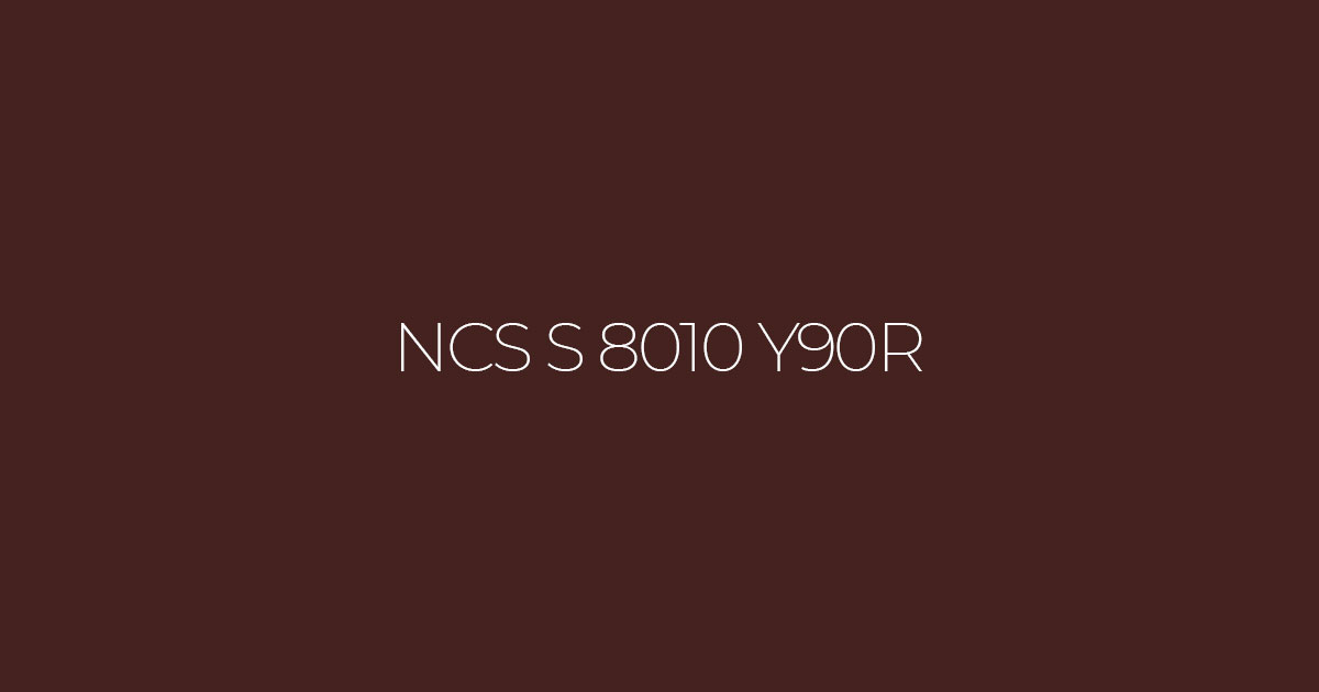
NCS S 8010 Y90R
A warmer shade with a richer reddish hue. It creates a cosy atmosphere, particularly when combined with soft lighting and natural materials.
How does the colour look under warm and cool lighting?
- Warm light (2700–3000 K): enhances reddish and yellow undertones; colours appear softer and more ‘appetising’, reminiscent of hot chocolate or cocoa. Ideal for evening settings in the living room and bedroom.
- Cool light (4000 K and above): slightly ‘dries out’ the colour, making it more subdued, closer to graphite-brown. Good for workspaces and kitchens where concentration and clarity are required.
Which colours go well with it (accent walls and furniture)
- Light beige / warm cream (NCS S 1005 Y40R, S 1005 Y50R) — a classic combination: dark chocolate + a light base. Suitable for the living room, bedroom and hallway.
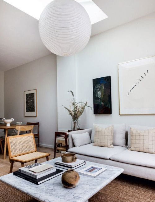
- Warm grey / taupe (S 2002 Y, S 3000 N) — a modern, understated option for Scandinavian and minimalist interiors.
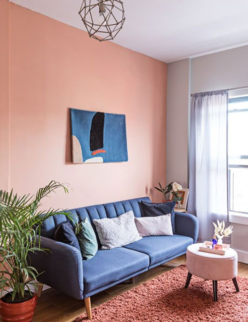
- Terracotta / muted orange (S 4040 Y60R, S 4040 Y70R) — adds energy, ideal for an accent wall in the dining room or lounge area.