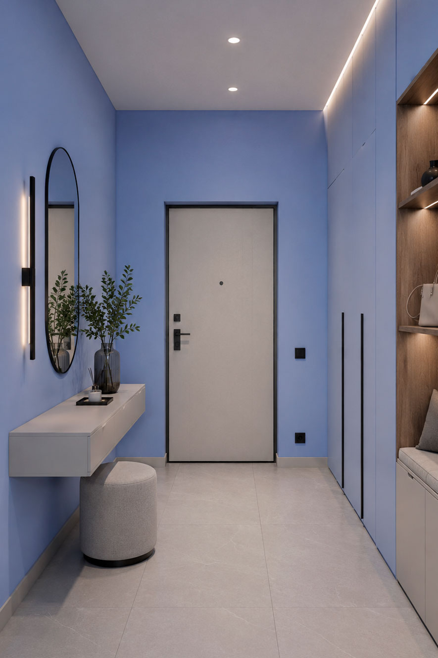
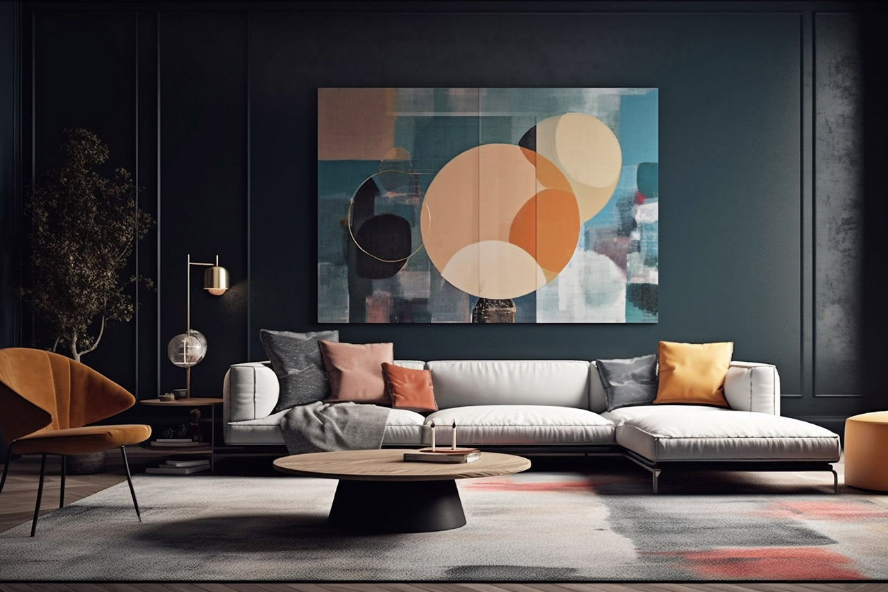
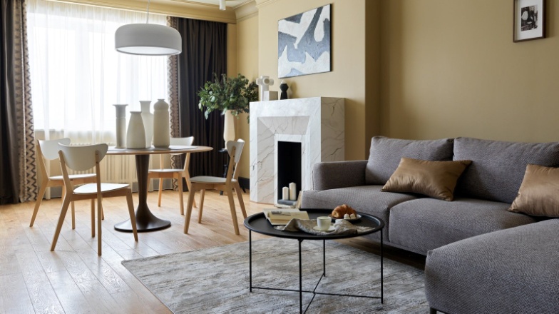
A dark blue colour scheme lends a space a sense of sophistication, depth and tranquillity. It is one of the most elegant colours for contemporary interiors, blending harmoniously with wood, metal, natural stone and decorative plasterwork.
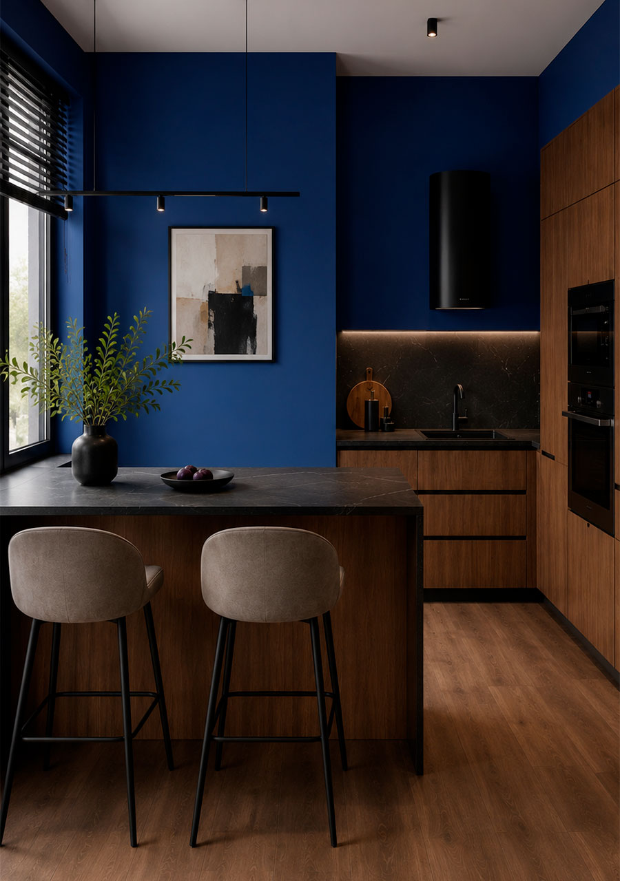
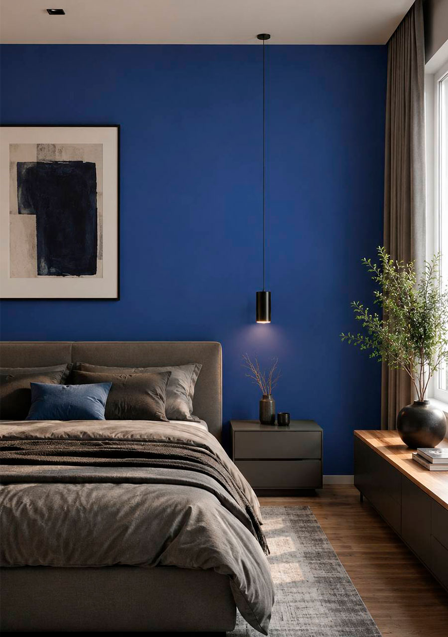
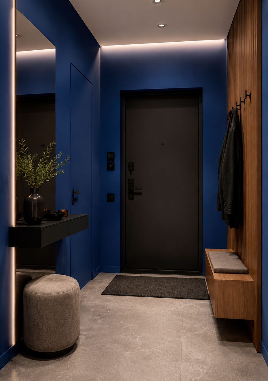
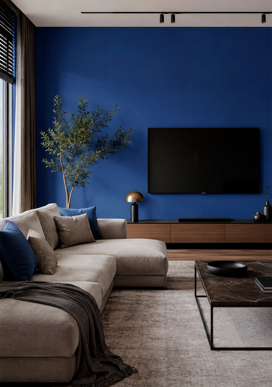
Colour NCS S 5040 R80B
A rich dark blue with a strong cool undertone, similar to classic ‘midnight’ blue. In a space, it creates a sense of depth, stability and elegant restraint. In interior design, this shade acts as a strong accent: it has a calming effect, encourages relaxation or concentration, highlights textures (velvet, metal, glass, polished wood) and looks particularly striking on large surfaces and when used to zone a space.

Two similar shades:
NCS S 5040‑R70B
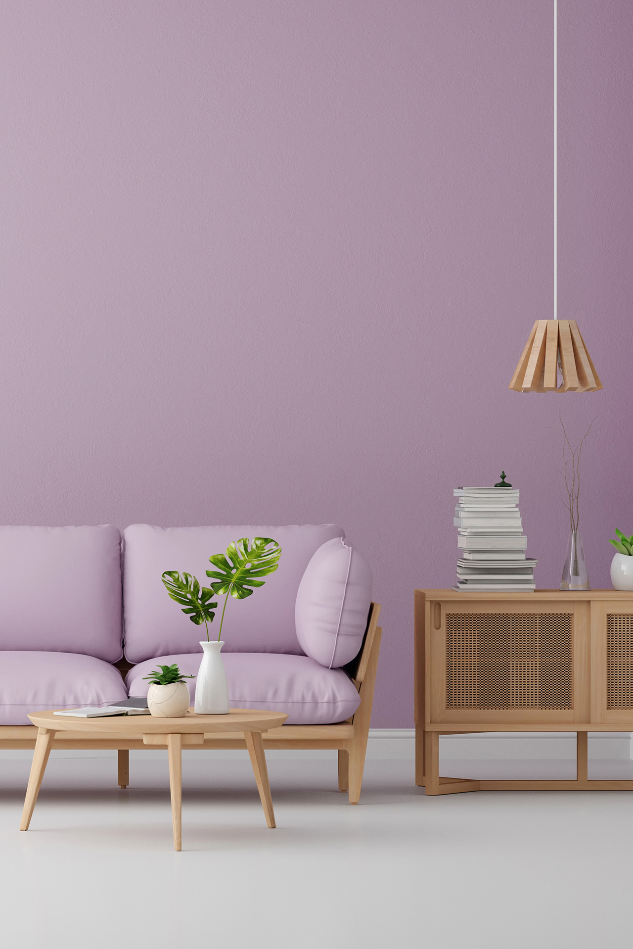
Slightly less blue, closer to a deep violet-blue. This is a ‘softer’ shade, which is easier to pair with warm wood and pink and violet accents in romantic and classic interiors.

NCS S 6030‑R80B
Even darker and richer, closer to the colour of a ‘night sky’. Ideal for feature walls, alcoves, studies and home cinemas where maximum depth and drama are required.

How does the colour appear under warm and cool lighting?
- Warm light (2700–3000 K): softens the coolness of blue, adds a touch of ‘velvety’ warmth, and makes colours appear deeper and cosier. Ideal for evening lighting in the living room, bedroom and dining room.
- Cool light (4000 K and above): enhances the cool blue undertone, making the colour sharper, more austere and closer to an ‘office’ look. Well-suited to workspaces, studies and bathrooms, where concentration and a sense of freshness are important.
Which colours go well with it (accent walls and furniture)
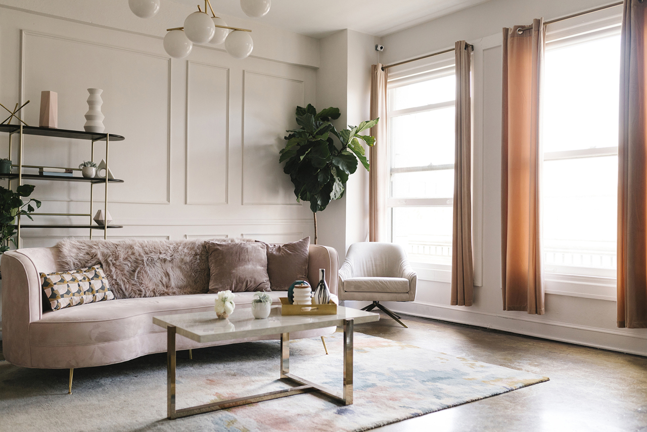
- Warm white / light beige (NCS S 0502‑Y, S 1005‑Y40R) — a classic combination: deep blue + a light base. Suitable for the living room, bedroom, hallway and dining room.
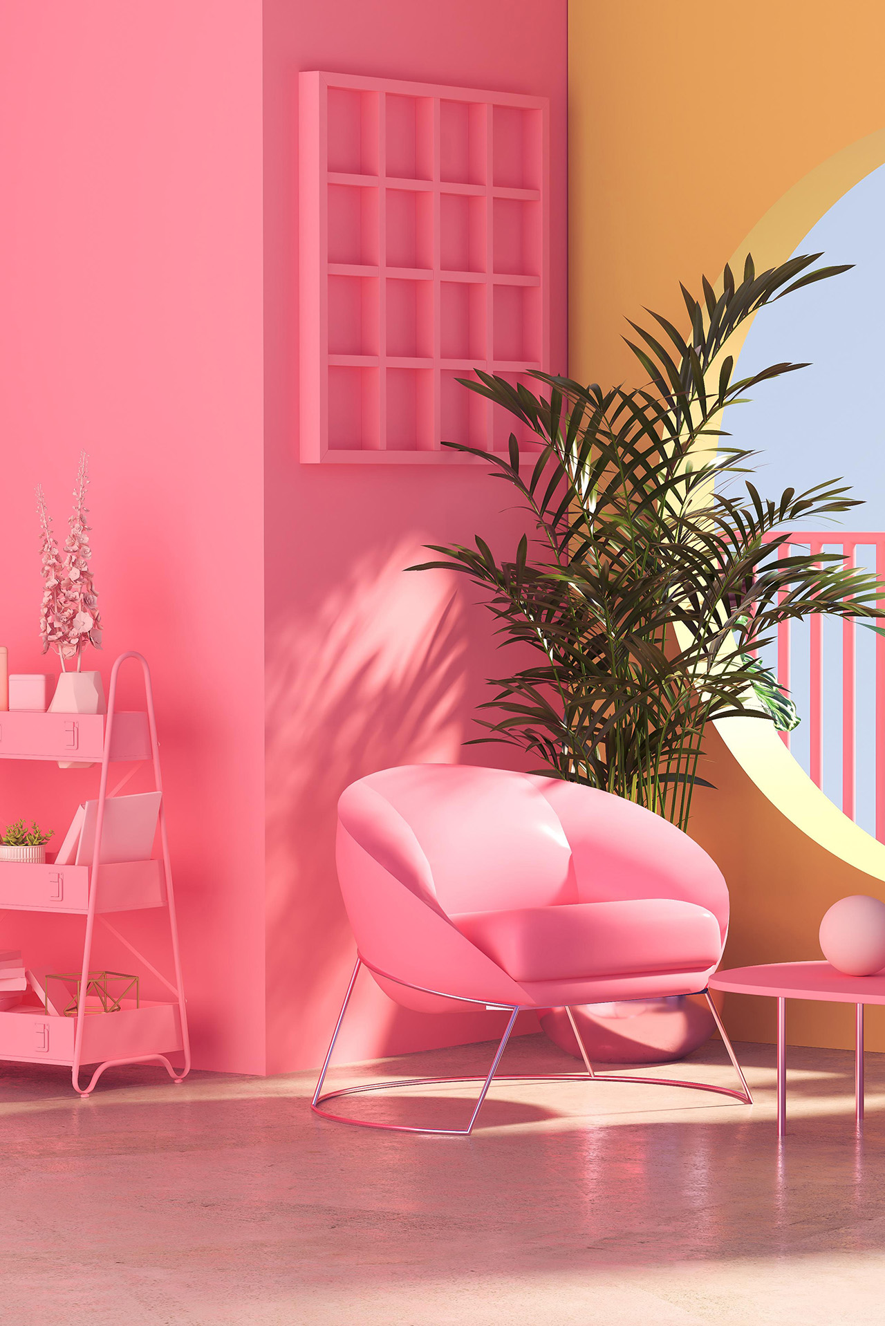
- Muted pink / powder (S 2020‑R, S 3020‑R) — creates a fashionable, contemporary ‘blue and powder’ colour scheme, a lovely choice for bedrooms and girls’ rooms.
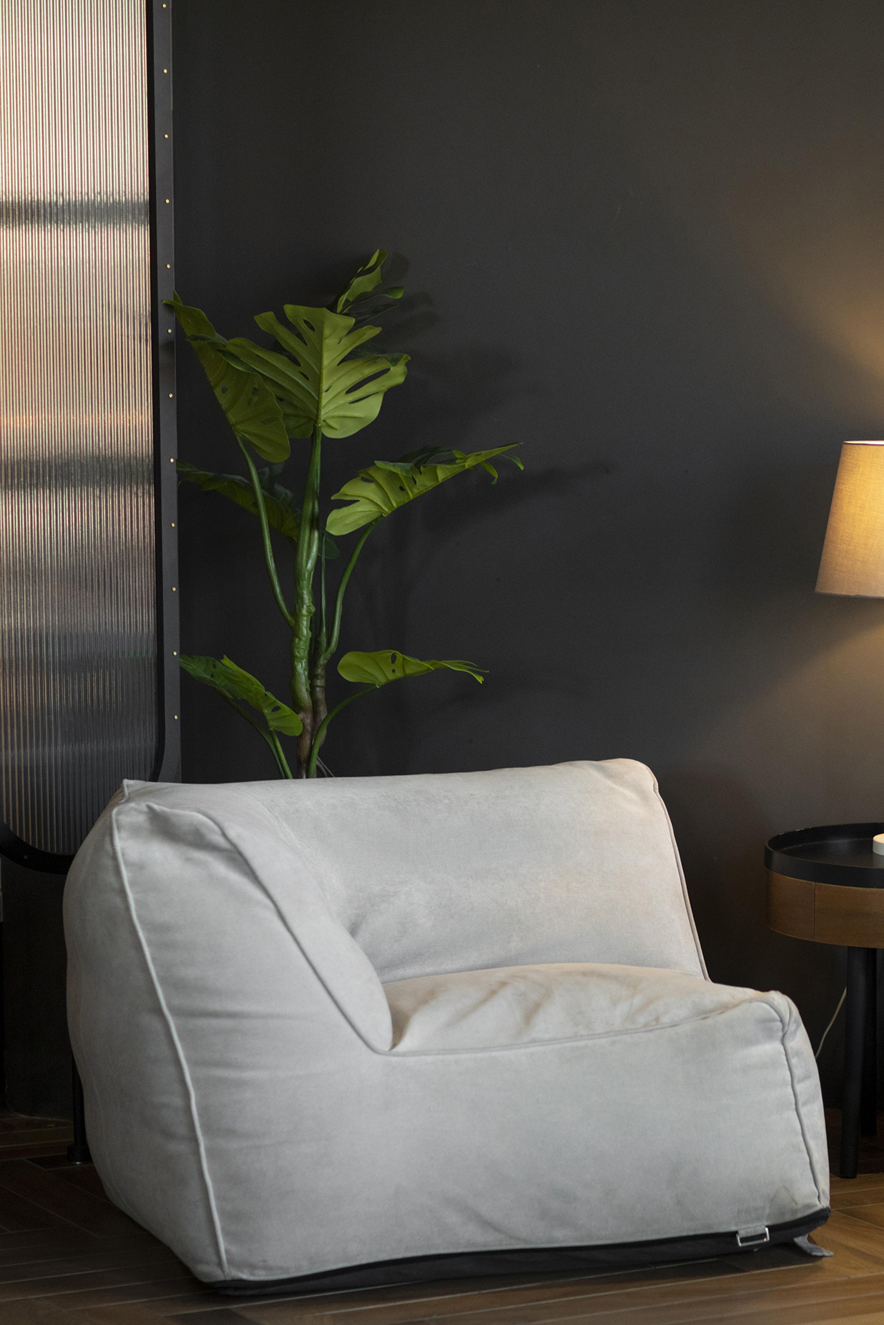
- Cool grey / graphite (S 4500‑N, S 5500‑N) — a stark, masculine combination for a study, a contemporary-style living room or a home cinema.