Decorative plaster in the "World Map" technique in the interior
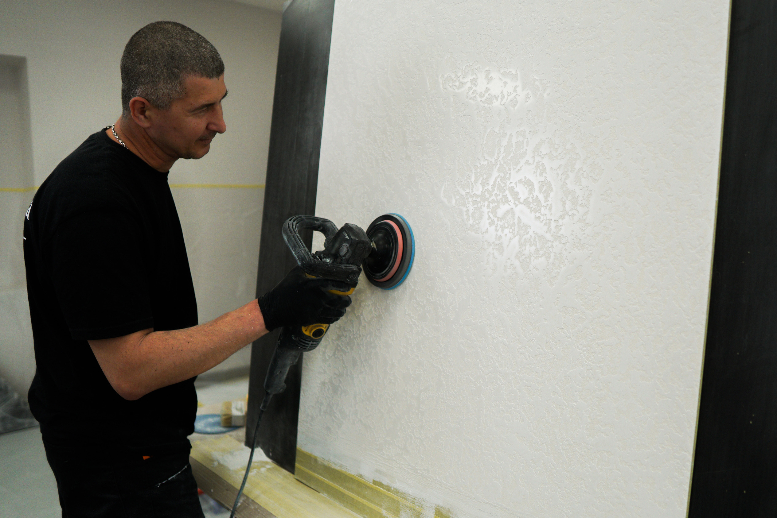
The " World Map" technique has already become a classical option for applying relief plasters and nacre coatings. It achieved its name due to its resemblance to the geographic map. In other words, lines and relief look like continents and oceans.
You can have a look at the relief decorative plaster Marmorino and decorative coating with the sparkling effect "Arabesk" in the "World Map" technique in the gallery of textures.
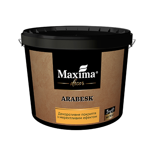
Arabesk
Decorative coating with a sparkle effect
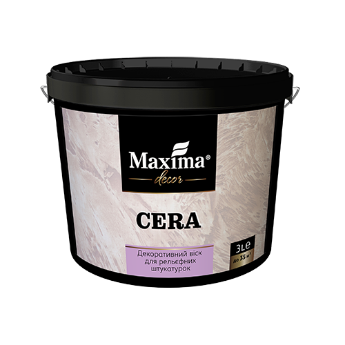
Cera
Decorative wax for textured stuccos
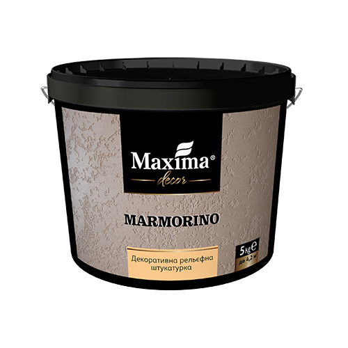
Marmorino
Decorative textured stucco
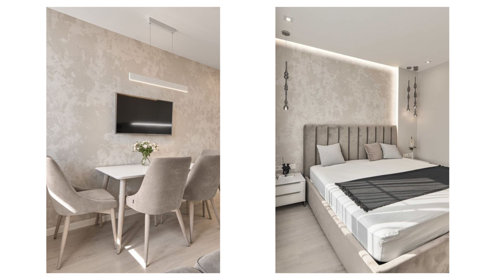
How to apply a decorative plaster in the "World Map" technique
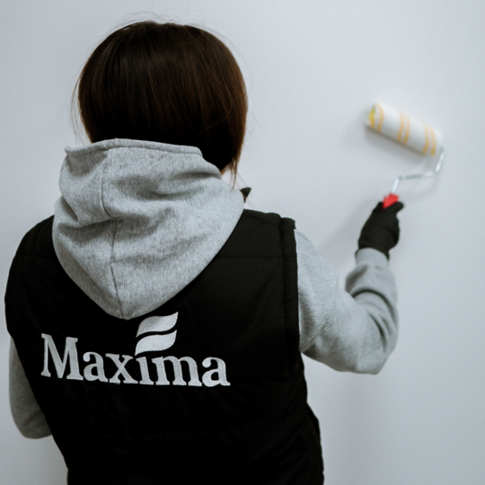
Application of all kinds of decorative plasters needs preparation. The surface shall be smooth, clean and dry before you've started working. First, you need to prime the surface to harden the surface and improve the adhesion of the materials. We recommend Aqua Primer - concentrated primer 1:10. Its drying time is less than 2 hours.
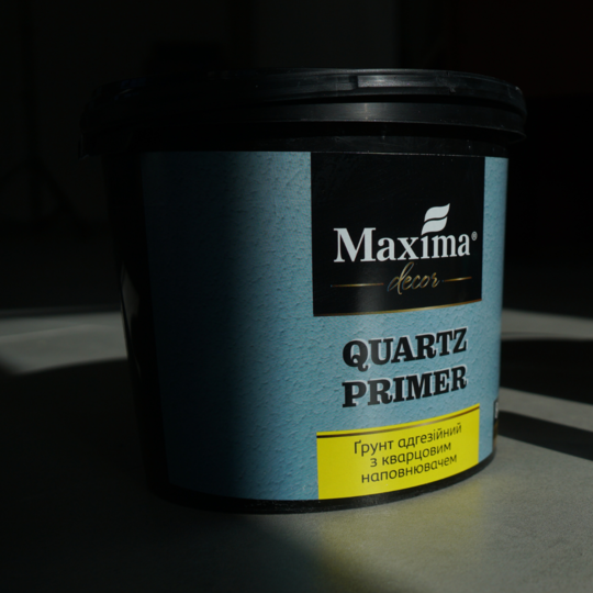
The second step is applying adhesive primer with quartz filler Quartz Primer. It simplifies the work with decorative coatings and their texture. Use a roller with a medium nap length for the Quartz Primer application. The drying period is 24 hours.
The next step is applying the first coat of decorative plaster with a trowel. The texture of the first coat can be homogeneous (equalize the surface with a spatula) or rough (form a texture with a short nap roller). Leave it for 24 hours.
What is the difference between a smooth and a rough first layer?
The first layer impacts the final look and the product consumption. A smooth base surface allows creating a smooth finishing coat without expressed volume. This option lessens the product consumption.
A rough base surface makes the pattern more expressive and textured and also increases product consumption.
Which option is better?
Everything depends on individual preferences. Modern trends dictate laconic, simple and natural style so each option can look in harmony with the interior.
Applying the second coat of decorative plaster. Apply some product with a trowel. Form texture, which resembles "peaks" or "islands", with chaotic moves by pulling off the tool from the surface. Let the plaster "stick" to the surface for 5-20 minutes. Then flatten the surface and leave it to dry completely. Quick smoothing forms a flatter and more homogeneous surface.
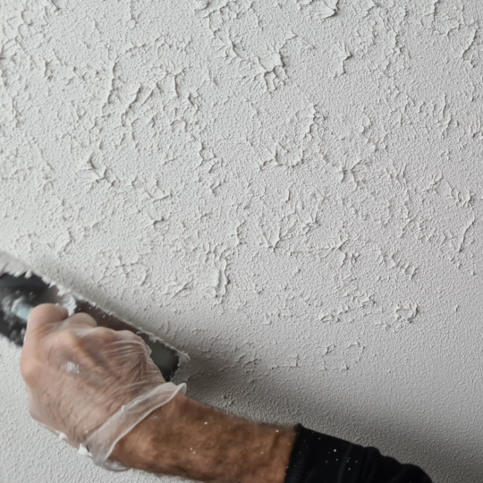
What role does the size and location of "peaks" and "islands" play?
Location and size form a visual result. The closer the "peaks" and "islands" from each other, the more expressive the texture. In other words the more "mainlands" there will be. The bigger the "islands of peaks" the bigger the area of the "mainland".
Map of the world made over textured plaster Marmorino
Marmorino in the technique of the "Map of the world" is a perfect decision for eco style, Wabi-sabi, Loft, Industrial, Grange and Scandinavian interior.
The main feature of Marmorimo is its realistic and natural texture, which imitates various kinds of stones, It is possible when you tint the plaster or wax.
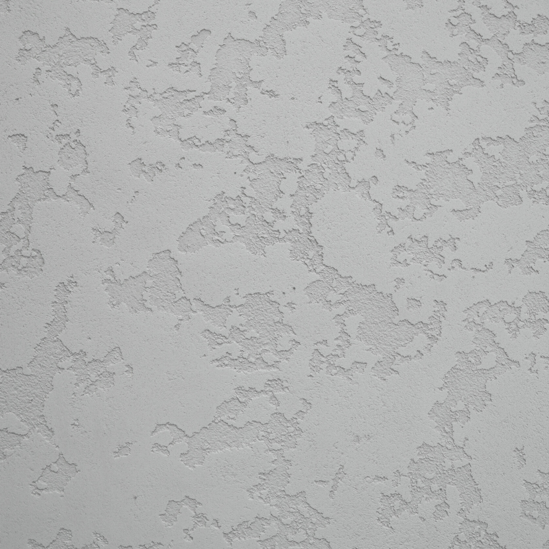
Decorative plaster Marmorino requires additional protection by covering with wax. Tinted wax allows emphasizing the texture better, creating volume and adding new shades. At the same time, if you tint the coating itself, you will not have the same result. However, there is one more option, when you tint both the wax and the decorative plaster in order the colors to look more saturated and the texture to be more expressive. By using colored wax you can mute the plaster saturation or even add other shades. The result depends on idea and imagination.
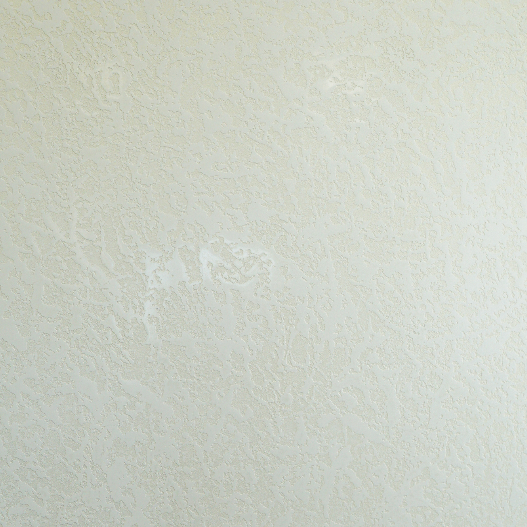
Decorative coating with glitter effect Arabesk - the Map of the world
Arabesk in the "Map of the world" technique resembles velour, silk or lurex. A nacre coating looks more delicate but depends much on the lighting. The source of light, temperature and the angle of light play an important role. You should also keep in mind that the material allows adding shades to the coating even when you are applying it. Depending on how you move a trowel or a spatula on the surface, nacre achieves light or dark shades.
Arabesk soft shine adds sophistication to the interior, that is why this coating suits designs in Barocco, Neo Classic, Electric, Modern and Ark-Deco.
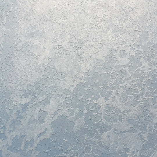
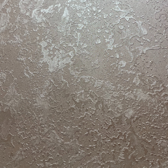
The "Map of the World" made with Arabesk may look different, depending on the chosen color of the coating.
Cold colors visually lighten the premise and make it cooler. Grey, grey-blue, blue, turquoise are ideal colors for a corridor, kitchen, study or playing room.
Warm colors make coziness and comfort. They make you relax and focus on rest. Beige, vanilla, ivory or white coffee are universal colors for a living room and bedroom.
- 27.05.2024
